

In this guide
Quick Answer
Color matching a composite in Photoshop means making the subject look like they belong in the backdrop scene. The three things you need to match are color temperature (warm vs cool), brightness and contrast (exposure match), and shadow direction (light source consistency). Use a Curves adjustment layer clipped to the subject to shift color temperature, a Levels layer to match brightness range, and a soft brush on a Multiply layer to paint realistic shadows. Getting these three elements right turns a cutout-on-a-background into a convincing photograph.
This guide covers the complete color matching workflow for portrait composites, from analyzing the backdrop's lighting to final adjustments that make the composite look seamless.
Why Color Matching Matters
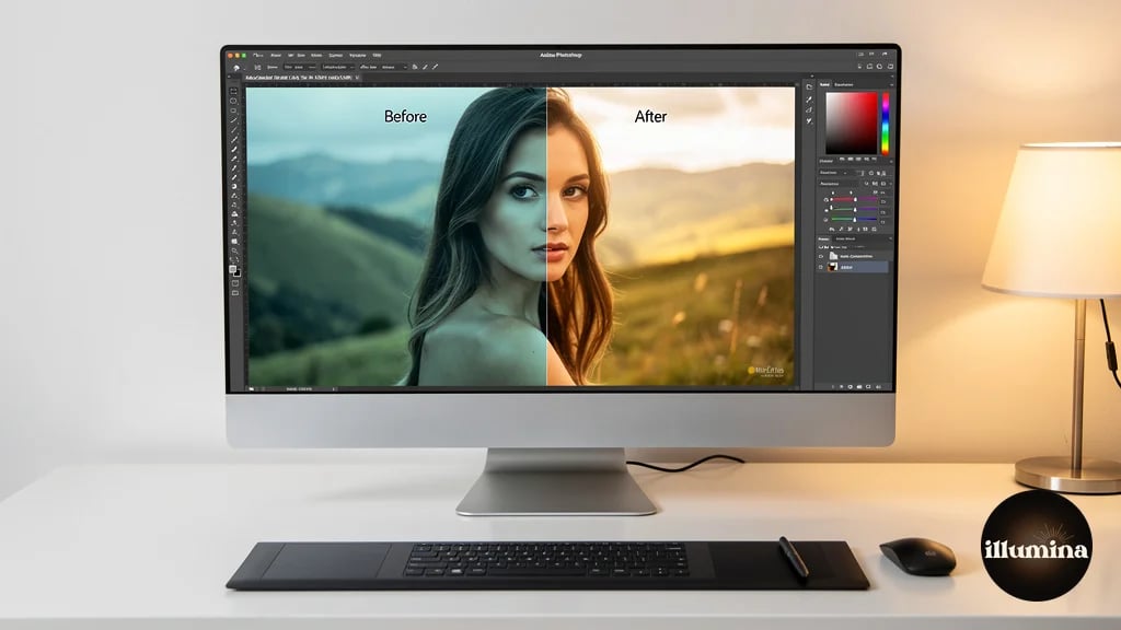
Your subject selection can be perfect. Your backdrop can be gorgeous. But if the color temperature of the subject does not match the backdrop, the composite looks wrong immediately. The human eye is remarkably sensitive to color temperature mismatches, even when viewers cannot articulate what exactly looks off. They just know it looks "fake" or "weird."
The most common mismatch is a subject lit with cool daylight studio lights placed on a warm golden hour backdrop. The subject appears blue-gray while the environment is warm amber. No amount of edge refinement or shadow work fixes this because the fundamental color relationship is broken. Color matching must be addressed before any other finishing work.
Professional compositors in film and advertising spend more time on color matching than on selection work. The selection is mechanical. Color matching is where craft meets eye, and it is the single skill that separates amateur composites from professional ones.
Step 1: Analyze the Backdrop
Before touching any sliders, study the backdrop image. Answer four questions about it.
What is the color temperature? Is the light warm (golden hour, tungsten, candles) or cool (overcast sky, shade, fluorescent)? Look at the highlights and shadows separately because outdoor scenes often have warm highlights and cool shadows.
Where is the light coming from? Top-left, direct front, behind the scene? The light direction in the backdrop must match the light direction on your subject. If the backdrop has light coming from the right and your subject is lit from the left, no amount of color correction will fix the directional mismatch. This is why planning your studio lighting to match your backdrop library matters before you even shoot.
What is the overall brightness? Is the scene bright and airy (beach, snow, daylight) or dark and moody (stadium lights, dusk, indoor)? Your subject's exposure needs to sit within the same brightness range as the backdrop environment.
What is the contrast level? High contrast scenes (harsh sun, spotlights) have deep shadows and bright highlights. Low contrast scenes (overcast, fog, studio softboxes) have compressed tonal range. Your subject should match this contrast level.
Step 2: Match Color Temperature
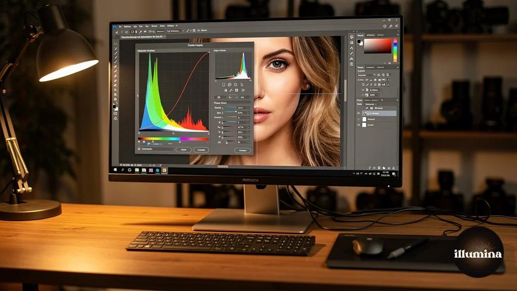
Create a Curves adjustment layer and clip it to your subject layer (Alt+click between the layers, or right-click and choose Create Clipping Mask). This ensures the adjustment only affects the subject, not the backdrop.
In the Curves dialog, switch to the Red channel. If the backdrop is warm and the subject is cool, pull the midpoint of the red curve slightly upward to add warmth. If the backdrop is cool, pull it down. Small moves make big differences. A shift of 3-5 points on the curve is often enough.
Switch to the Blue channel. This controls warm/cool in the opposite direction from red. If the backdrop is warm, pull the blue curve midpoint down (reduces blue, adds yellow warmth). If cool, pull it up.
The Green channel rarely needs much adjustment for color temperature matching, but check it. Some artificial lighting creates green color casts that need correction.
Use the eyedropper comparison technique. Sample a neutral gray or skin tone area on the backdrop (if people are visible in it) and compare the RGB values to a similar tone on your subject. The values should be in the same ballpark. If the backdrop's neutral gray reads R:180 G:170 B:155 (warm) and your subject's skin reads R:165 G:170 B:180 (cool), you know you need to add red and reduce blue on the subject.
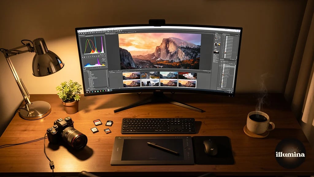
Work on a calibrated monitor. Color matching on an uncalibrated display is guesswork. A monitor that displays too warm will make you over-correct toward cool, and vice versa. A basic hardware calibrator like a Datacolor SpyderX costs $100-150 and pays for itself in the first month by eliminating the "it looked fine on my screen" problem.
Step 3: Match Brightness and Contrast
Create a Levels adjustment layer, clipped to the subject. The Levels histogram shows your subject's tonal range. Compare it visually to the backdrop's tonal range.
If the backdrop is a bright, airy scene and your subject was shot with normal studio exposure, the subject will likely be too dark. Slide the midtone slider (the middle triangle under the histogram) to the left to brighten the subject. Avoid pushing highlights to pure white unless the backdrop has blown highlights too.
If the backdrop is dark and moody (stadium lights, nighttime, dramatic lighting), the subject may be too bright. Slide the midtone slider to the right to darken. Pull the output level whites down slightly to cap how bright the subject can get, matching the contained highlight range of a dark scene.
Contrast adjustment: if the backdrop has high contrast (deep blacks, bright highlights), increase the subject's contrast by pulling the shadow input slider right and the highlight output slider left. If the backdrop is low contrast (misty, foggy, soft light), reduce the subject's contrast by pulling the black output level up (raising the darkest point) and the white output level down (capping the brightest point).
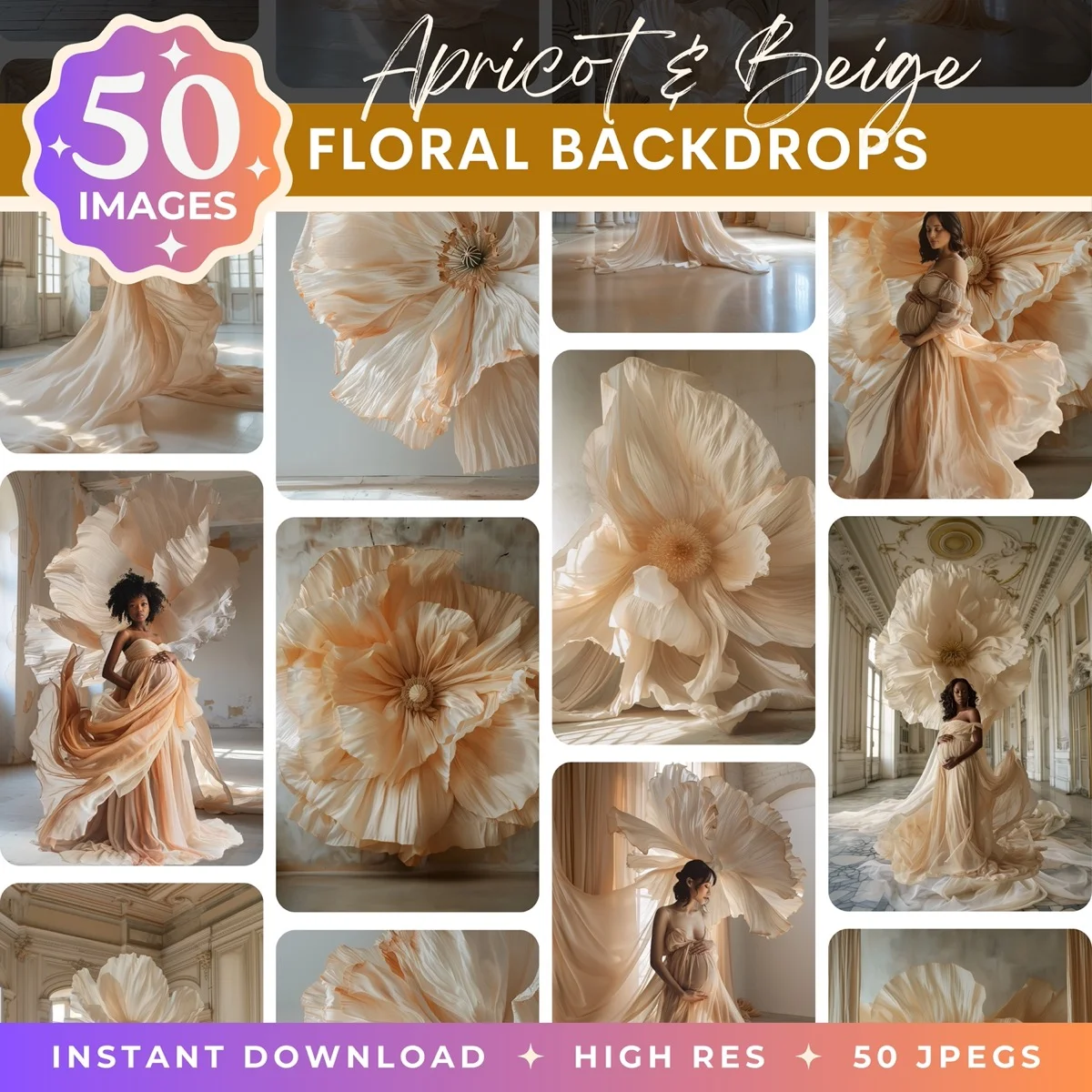
Transform Your Photos
Give Your Photos the Wow Factor
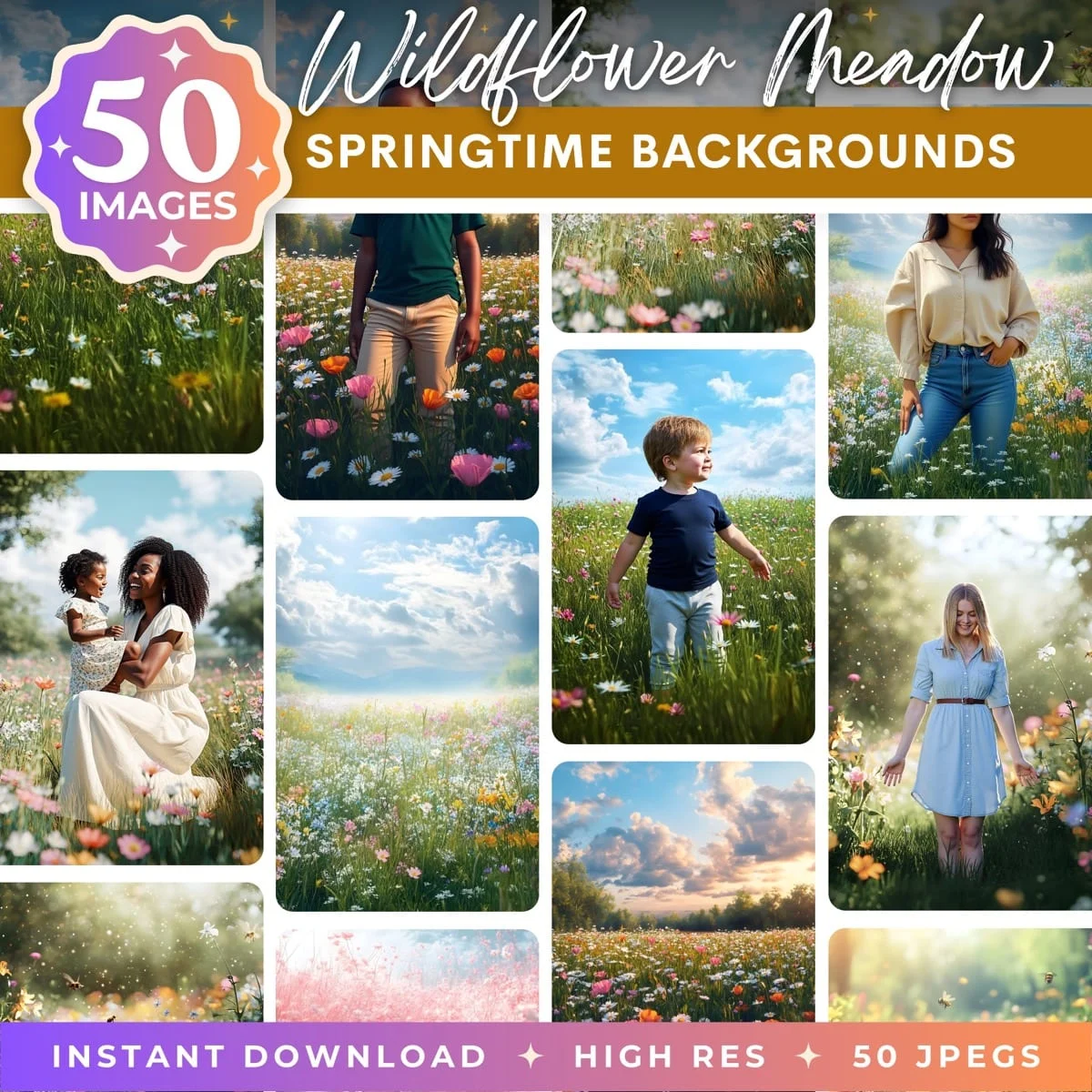
Browse our collection of premium digital photo backdrops. 50 high-resolution print-ready backgrounds in each pack. Instant download.
Browse Backdrops

Step 4: Match Shadow Color
This is the detail that most tutorials skip and that makes the biggest difference. Shadows are not black. They are colored. Outdoor shadows in daylight are cool blue because they are lit by the blue sky rather than the warm sun. Indoor shadows under tungsten light are warm amber. Stadium shadows under mixed lighting are often slightly green or magenta.
Zoom into a shadow area of the backdrop and sample its color. Note the RGB values. Then zoom into a shadow area on your subject and compare. If the backdrop shadows are blue-tinted (higher blue value relative to red and green) and your subject's shadows are neutral gray, you need to add blue to your subject's shadows.
In the Curves adjustment layer you already created, select the Blue channel. Instead of adjusting the midpoint (which affects the overall color), click on the shadow region of the curve (the lower-left area) and pull it up slightly. This adds blue only to the dark tones, matching the backdrop's shadow color without affecting the midtones and highlights.
This technique works for any shadow color. Red-tinted shadows from sunset light? Add red to the shadow region. Green-tinted shadows from foliage? Add green. The principle is the same: match the color of the subject's shadows to the color of the backdrop's shadows.
Step 5: Add Grounding Shadows
A subject without a shadow looks like it is floating. Even if your color matching is perfect, the missing shadow breaks the illusion instantly. Adding a contact shadow (the shadow directly beneath and around the subject's contact point with the ground) is essential.
Create a new layer between the subject and the backdrop. Set its blend mode to Multiply. Select a soft, round brush at 10-20% opacity. Sample a dark color from the backdrop's shadow areas (not pure black, which looks unnatural).
Paint directly beneath the subject's feet or seated position. Build up the shadow gradually with multiple light strokes rather than one dark pass. The shadow should be darkest directly at the contact point and fade quickly as it extends outward. For standing subjects, the shadow extends 6-12 inches in the direction opposite the light source. For seated subjects, it spreads more broadly beneath the entire body.
Gaussian blur the shadow layer (Filter > Blur > Gaussian Blur) at 15-30 pixels to soften the edges. Shadows in real life are never sharp-edged unless the light source is extremely hard and close. A soft shadow looks natural. A hard shadow looks painted on.
Reduce the shadow layer's opacity until it looks right. Start at 40-50% and adjust down from there. The shadow should be visible but not obvious. If you notice the shadow before you notice the subject, it is too dark or too sharp.
Study real photos for shadow reference. Before compositing, find a reference photo shot in similar lighting conditions to your backdrop. Study how the shadows fall, how dark they are relative to the surroundings, and how they blur at the edges. Match your painted shadow to that reference. Real shadows are your best teacher for fake ones.
Step 6: Environmental Color Effects
In real photography, the environment affects the subject's colors. Green grass bounces green light onto legs and lower clothing. A warm-toned wall adds warmth to the nearby side of the face. Blue sky adds cool fill light to the top of the head and shoulders. These subtle color interactions happen naturally in real photos but are absent in composites unless you add them.
Create a new layer above the subject, set to Soft Light or Overlay blend mode at 10-20% opacity. Sample a dominant color from the backdrop near the subject's position. Paint lightly on the edges of the subject that would be closest to that environmental element. If the subject is standing on green grass, add a faint green wash to the bottom of their shoes and lower legs. If there is a warm wall to their left, add a faint warm wash to the left side of their face and body.
This environmental color spill is subtle. If it is visible as a distinct color overlay, you have gone too far. Reduce opacity until it is felt more than seen. The viewer should not notice the green on the shoes. They should just feel that the subject belongs on that grass.
Step 7: Final Atmosphere
The last step is matching atmospheric conditions. Outdoor scenes have haze, fog, or atmospheric perspective that reduces contrast and shifts distant objects toward blue or gray. If your backdrop has this quality and your subject is razor-sharp and fully saturated, the subject will look pasted on top of the scene rather than existing within it.
For most composites where the subject is in the foreground, adding a very slight haze effect unifies the image. Create a Solid Color adjustment layer set to the color of the backdrop's atmosphere (usually a light blue-gray for outdoor scenes). Set the blend mode to Normal and reduce opacity to 3-8%. Mask this layer so it only affects the subject. This imperceptible tint of atmospheric color integrates the subject into the scene's air.
Alternatively, apply a slight Gaussian blur (0.5-1.0 pixel radius) to the very edges of the subject's mask. Real camera optics produce slightly soft edges due to depth of field and lens physics. A perfectly razor-sharp selection edge against a slightly soft backdrop is a compositing tell that this technique eliminates.
Quick Color Matching Checklist
Before finalizing any composite, run through this checklist. Each item takes 30 seconds to verify and catches the most common issues.
Check highlight color. Sample a bright area on the subject and a bright area on the backdrop. The RGB values should have similar ratios. If the backdrop highlights are warm (R highest) and the subject highlights are neutral (R=G=B), adjust the subject's highlights with Curves.
Check midtone color. Same process with a mid-brightness area. This is where skin tones live, so getting midtones right is critical for portraits. Midtone color is controlled by the center point of the Curves adjustment.
Check shadow color. Sample dark areas from both. Shadows carry the most environmental color information. This is the step most people skip, and it is the step that matters most for believability.
Check overall brightness. Squint at the composite. Does the subject pop out as too bright or too dark relative to the scene? Squinting removes detail and lets you evaluate overall luminosity more accurately.
Check edge quality. Zoom to 100% and scroll around the subject's edges. Look for bright halos (from the original backdrop showing through), dark fringing, or unnaturally sharp edges against a soft backdrop. Refine the mask or add a slight edge blur as needed.
Check the shadow. Is there a grounding shadow beneath the subject? Does it match the backdrop's shadow direction and darkness? Is it soft enough to look natural?
Flip the image horizontally as a final check. Your brain gets used to seeing the composite in one orientation and stops noticing problems. Flipping it resets your perception and makes color mismatches, edge issues, and shadow problems suddenly obvious. Fix what you see, then flip it back.
Common Mistakes
Over-correcting. Small adjustments compound. Moving curves 3 points across four channels creates a dramatic shift. Start with less correction than you think you need, and add more only if the match is still off.
Ignoring shadow color. Matching highlights and midtones but leaving shadows at neutral gray is the most common compositing tell. Shadows carry the environmental color of the scene. Match them.
Using pure black for shadows. Real shadows are never pure black. They are dark versions of the environmental color. Sample from the backdrop's existing shadows and use that color for your painted shadows.
Skipping environmental color spill. It is the subtlest step and the easiest to skip, but its absence is what makes composites look "clean but fake." Real photos are messy with color interactions. Your composites should be too.
Working on an uncalibrated monitor. Every color decision you make is wrong if your display is wrong. Calibrate before you composite.
Professional scenes designed for perfect color matching

One last technique worth mastering: the color lookup table (LUT) approach. Apply the same color grading LUT to both the subject and the backdrop as a final unifying step. A LUT is a preset color transformation that shifts all colors in an image consistently. When both layers pass through the same LUT, they share a color palette that makes the composite feel cohesive even if your manual color matching was not perfect. In Photoshop, add a Color Lookup adjustment layer at the top of your layer stack (above both subject and backdrop) and choose a subtle film emulation or color grade. This is not a replacement for the manual color matching steps above. It is a finishing touch that ties everything together under one unified color treatment, similar to how a film director grades an entire scene to create a consistent visual feel across different shots.
Color matching is the difference between a composite that looks assembled and one that looks photographed. The technical steps are straightforward: match temperature, match brightness, match shadow color, add grounding shadows, add environmental spill, unify with atmosphere. The skill is in knowing how much of each adjustment to apply, and that comes from practice and studying real photographs. Start with the Curves clipping mask technique on your next composite, and you will see the difference in your first attempt.
Transform Your Photos
Give Your Photos the Wow Factor
Browse our collection of premium digital photo backdrops. 50 high-resolution print-ready backgrounds in each pack. Instant download.
Browse Backdrops

