
In this guide
The Quick Answer
Got a subject with the background already removed? Open Canva, upload your backdrop image, upload your transparent-background subject on top, resize and position it, and export. That's it. Thirty seconds if you've done it before.
But "adding a background" covers a lot of ground. Maybe you're a photographer compositing a portrait onto a digital backdrop for a client. Maybe you're fixing a vacation photo where the sky looked washed out. Maybe you just want to swap a boring wall for something more interesting. The tools and techniques change depending on what you're actually trying to do.
This guide covers every major method, from free browser tools to professional Photoshop workflows, plus the part most tutorials skip: how to make the final result look real instead of obviously pasted together.
How to Add a Background in Canva
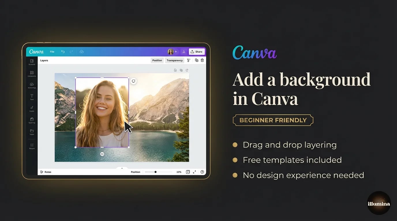
Canva is the fastest way to add a background to a photo if you don't need pixel-perfect control. The free version handles basic compositing. Canva Pro ($13/month) adds the background remover, better export quality, and more editing flexibility.
Step-by-step walkthrough
Start a new design in Canva. Set your dimensions to match what you need. For print work, go large: 4000x6000 pixels or higher. For social media, pick the platform preset (1080x1080 for Instagram, 1000x1500 for Pinterest).
Click "Uploads" in the left panel and upload your new background image. Drag it onto the canvas and resize it to fill edge to edge. Right-click and lock it in place so you don't accidentally nudge it later.
Now upload your subject photo. If the background is already removed (transparent PNG), just drag it on top of the backdrop and you're layering. If the background is still there, click the image, hit "Edit Image," and use BG Remover to strip it out. Canva Pro's remover is solid for most well-lit photos against clean backgrounds.
Resize your subject to look proportional within the scene. This is where most people rush and the result looks off. A subject that's too large for a wide stadium backdrop, or too small for a close-up studio scene, breaks the illusion immediately.
Getting the layers right
Canva stacks elements in the order you add them. Your backdrop should be the bottom layer, your subject on top. If things are in the wrong order, right-click and use "Send to back" or "Bring to front."
For multi-subject composites (team photos, family portraits), layer each person individually. Position them so they overlap naturally. Subjects in front should be layered on top of subjects behind them.
Color matching in Canva
Click your subject, go to "Edit Image," and adjust brightness, contrast, and warmth to match the backdrop. If the backdrop is warm and golden, your subject shouldn't look cool and blue-toned. Even small adjustments make a noticeable difference.
Canva's built-in filters can help too. Apply the same filter to both the backdrop and the subject (or to the entire design) for a unified look.
Exporting for print vs web
For print: download as PNG at the highest quality setting. Print shops need at least 300 DPI, which means your canvas dimensions matter. A 4000x6000 pixel image prints at roughly 13x20 inches at 300 DPI. If your canvas is only 1080x1080, you'll get a blurry 3.6-inch print. Plan your dimensions before you start.
For web and social media, PNG or JPG both work. JPG files are smaller, which means faster loading. PNG preserves more detail but creates larger files. If the image will only ever be viewed on a screen, JPG is fine.
How to Add a Background in Photoshop
Photoshop gives you complete control over every pixel. If you're doing client work, especially portrait or sports photography with digital backdrops, this is where you should be working.
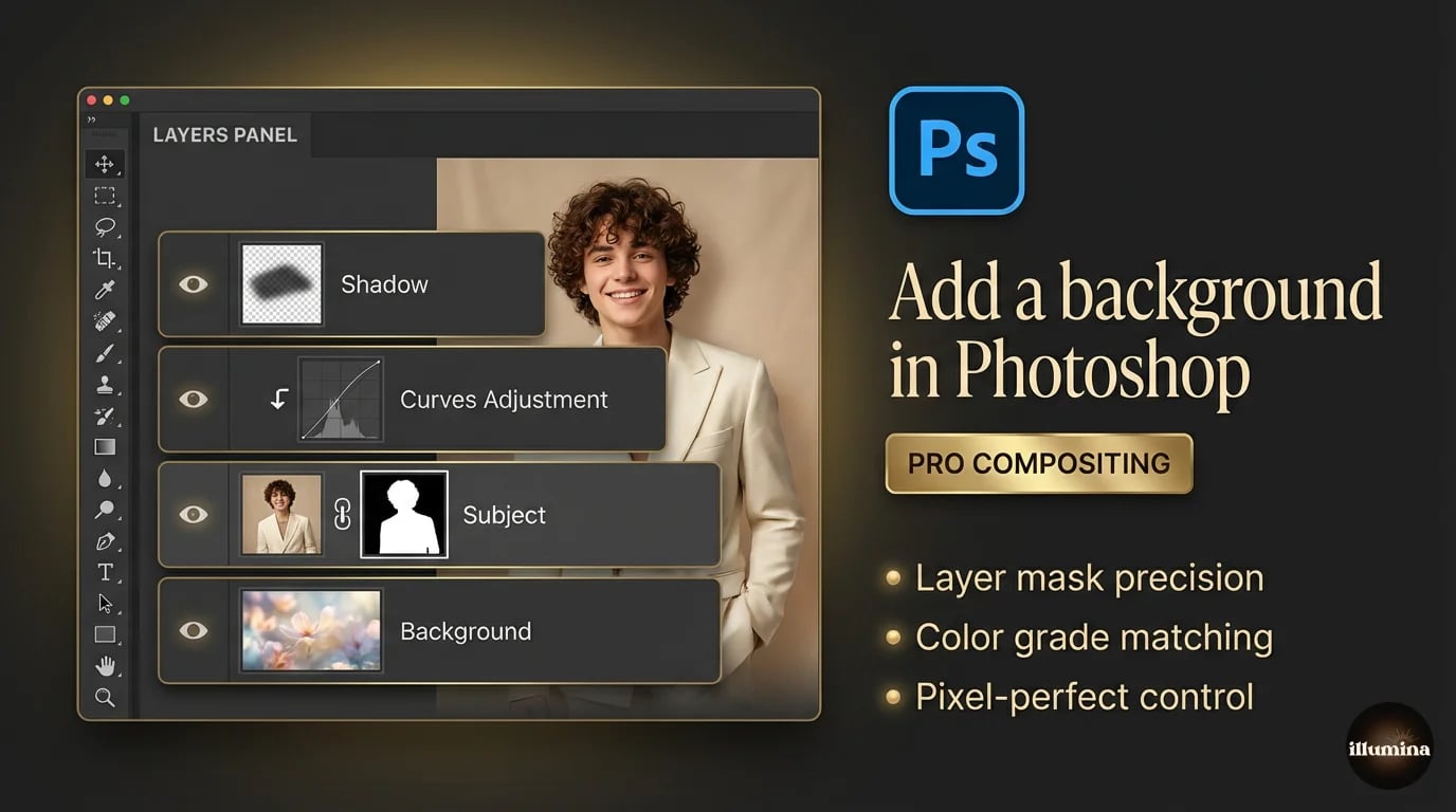
Setting up the layers
Open your backdrop image in Photoshop. Then open your subject file. If it's a transparent PNG, drag it directly onto the backdrop document. If it still has its original background, you'll need to extract the subject first. (Our background removal guide covers every method in detail.)
Your Layers panel should now show the backdrop on the bottom and your subject above it. Use Ctrl/Cmd+T (Free Transform) to resize and position the subject. Hold Shift while dragging corners to keep proportions locked.
Refining the mask edges
Even good extractions leave rough edges. Zoom in to 200% or more and inspect the boundary between your subject and the new backdrop. Look for:
- Fringing: a thin halo of the old background color clinging to your subject's edges
- Jagged pixels along curves and diagonal lines
- Missing hair strands or overly smooth hairlines
To fix fringing, select the subject's layer mask, go to Select and Mask, and use the Decontaminate Colors checkbox. This replaces edge pixels with colors sampled from nearby subject pixels instead of the old background. It works remarkably well for color spill.
For jagged edges, the Smooth and Feather sliders in Select and Mask help. Go easy on Feather. Too much makes your subject look like a ghost. Usually 0.5 to 1.5 pixels is enough.
Matching lighting with Curves and Color Balance
This is where Photoshop separates itself from every other tool. Clip a Curves adjustment layer to your subject (Alt/Option-click between the layers). Now you can adjust the brightness and contrast of your subject without touching the backdrop.
Pull the midpoint of the curve up to brighten or down to darken. Match the overall exposure to the backdrop. If the backdrop is a moody, low-key scene, your subject needs to be darker too. A brightly lit subject on a dark background screams "composite."
Add a Color Balance adjustment layer, also clipped to the subject. Shift the midtones toward the dominant color temperature of the backdrop. Warm backdrop? Push toward yellow and red. Cool, blue-hour scene? Push toward cyan and blue. Small shifts. You're nudging, not overhauling.
Creating realistic shadows
Subjects without shadows float. It's one of the most common composite mistakes, and it's also one of the easiest to fix.
Create a new layer between your subject and the backdrop. Set it to Multiply blending mode. Use a soft black brush at 10-20% opacity and paint shadows beneath your subject's feet and along contact points. Build up gradually. Multiple light strokes look more natural than one heavy pass.
Match the shadow direction to the light in the backdrop. If light comes from the upper left in the backdrop, shadows should fall to the lower right. If you're not sure where the light is coming from, look at highlights and shadows already in the backdrop scene for clues.
Adding depth with blur
Real photographs have depth of field. Objects closer to or farther from the camera are slightly out of focus. If your backdrop has any visible depth, consider applying a subtle Gaussian blur to the backdrop layer (Filter, Blur, Gaussian Blur, 2-5 pixels).
This creates natural separation between your sharp subject and the background environment. Don't overdo it. Heavy blur looks fake and draws attention to the compositing. Subtlety is everything.
Pro tip: If the backdrop already has natural depth of field built in (blurred elements in the distance, sharp elements up close), you may not need any additional blur. Quality digital backdrop packs are often designed with this depth already baked in.
Free Online Tools for Changing Backgrounds
Not everyone has Photoshop, and not every project needs it. These browser-based tools handle background replacement with zero software installation.
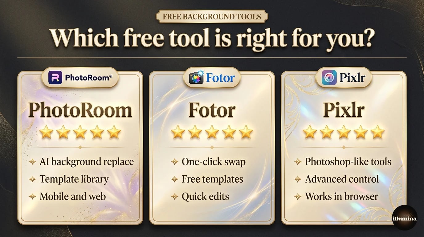
PhotoRoom
The best free option for quick background swaps. Upload your photo, PhotoRoom removes the background automatically, then you can choose from their built-in backgrounds or upload your own. The AI is accurate, the interface is clean, and the whole process takes about a minute. The free tier adds a small watermark. The paid version removes it.
PhotoRoom also has solid batch processing. If you're swapping backgrounds on 20 product photos, you can run them all at once. That alone makes it worth considering for e-commerce sellers.
Fotor
Combines background removal with a full photo editor. Fotor gives you adjustment tools, filters, and templates alongside the background changer. The removal quality is a step below PhotoRoom for complex edges (especially hair), but for subjects with clean outlines, it does the job. Free with watermark, paid for full resolution.
Pixlr
The closest thing to Photoshop in a browser. Pixlr X is the simplified version. Pixlr E is the advanced editor with layers, masks, and selection tools similar to Photoshop. If you want more control than PhotoRoom offers but can't install desktop software, Pixlr E is your best bet. The learning curve is steeper, but you get real compositing power.
The tradeoffs
Free tools give you speed and convenience. They take away control and output quality. Hair edges are rougher. Color matching is limited or nonexistent. Export resolution is often capped unless you pay. For social media posts and quick mockups, they're great. For print-quality client work, you'll hit their limits fast.
Transform Your Photos
Give Your Photos the Wow Factor
Browse our collection of premium digital photo backdrops. 50 high-resolution print-ready backgrounds in each pack. Instant download.
Browse Backdrops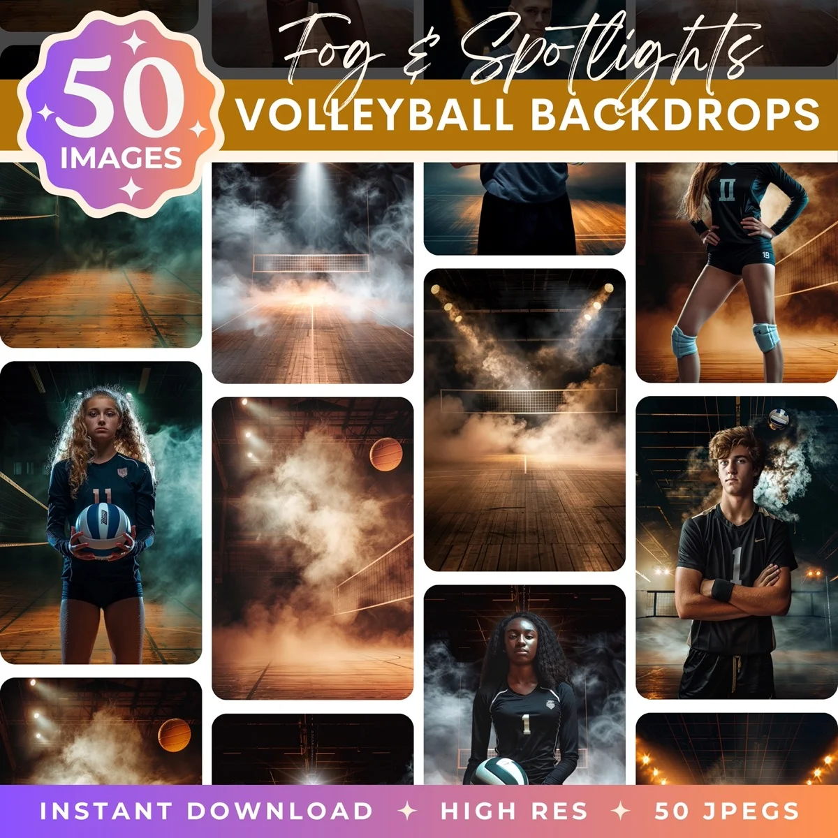

How to Add a Background on Your Phone
Sometimes you need to swap a background from your couch, not your desk. Both iPhone and Android have good options now.
iPhone
iOS 16 and later lets you lift subjects directly from photos (long-press, then copy). Paste the cutout into any image editing app. But for actually compositing onto a new background, you'll need a third-party app.
PhotoRoom's mobile app is the best option. Same AI as the web version, optimized for phone screens. Upload your background, upload your subject, position and resize. The app handles removal and compositing in one workflow.
Bazaart is another strong pick for iOS. It gives you more manual control over the cutout, with erase and restore brushes that work well on a touchscreen.
Android
Google Photos' Magic Editor can swap backgrounds on Pixel devices. Samsung Gallery offers similar features on Galaxy phones. For a dedicated background changer that works across all Android devices, PhotoRoom's Android app mirrors the iOS version closely.
LightX gives Android users layer-based editing with background removal built in. It's more capable than most phone editors, though the interface takes some getting used to.
Phone editing limitations
Be realistic about what phone apps can do. Small screens make precision work difficult. Color matching by eye on a phone display isn't reliable. And processing power limits how large your output files can be. Phone composites are great for social content. For anything that needs to look professional at full size, move to a desktop.
Using Digital Backdrop Packs
This is where background replacement gets really practical for photographers. Instead of scouting locations, fighting weather, and hoping for the right natural light, you shoot subjects in a controlled studio and composite them onto professional digital backdrops.
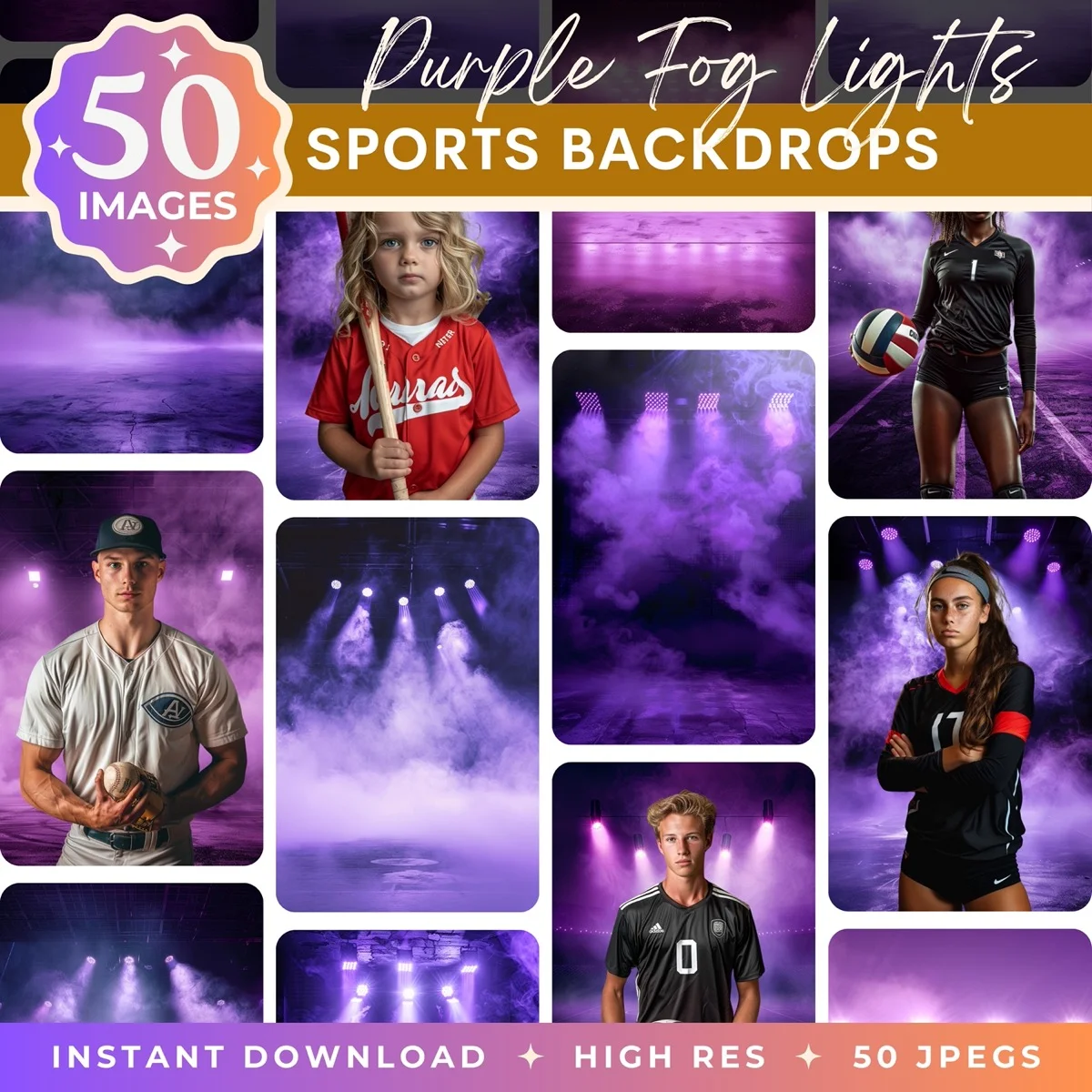
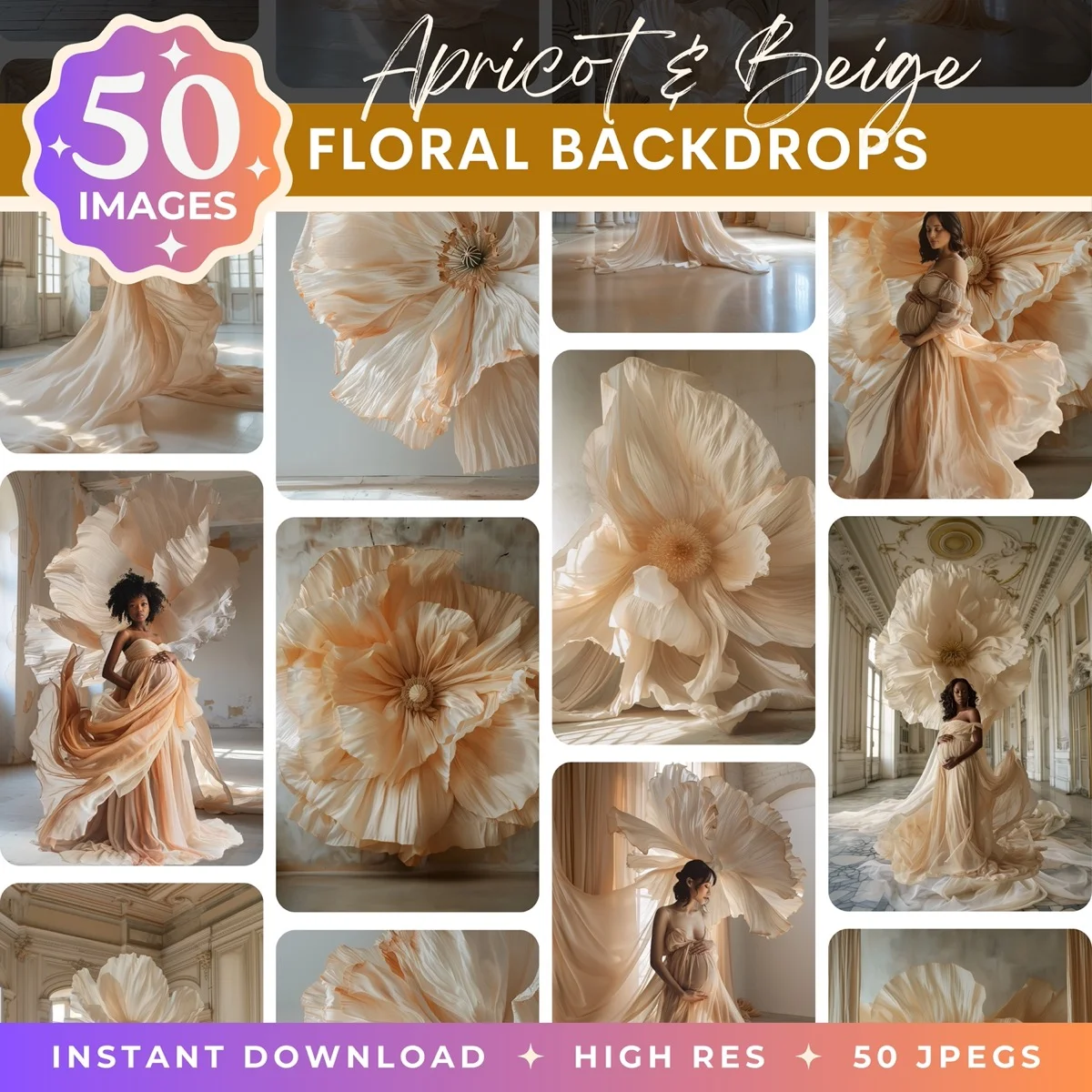
What digital backdrop packs actually are
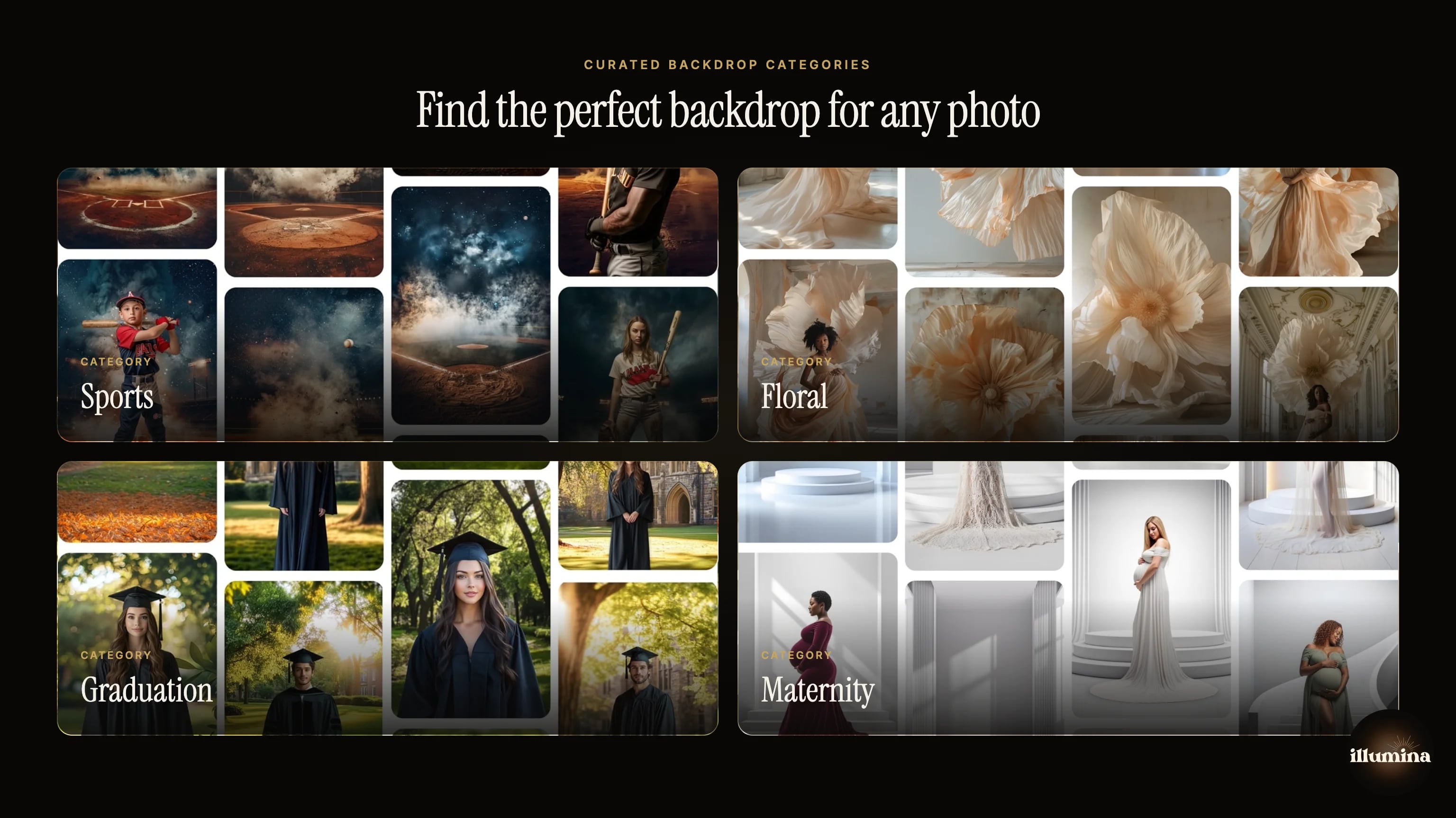
A backdrop pack is a collection of high-resolution images designed specifically for compositing. Think dramatic fog-filled sports stadiums, dreamy floral archways, elegant studio setups with podiums and soft lighting, moody forest scenes. Each pack typically includes dozens of images in both portrait and landscape orientations.
Photographers buy a pack once, then use it across an entire season of client sessions. One sports backdrop pack can serve hundreds of individual player composites. The economics are straightforward: the pack costs a fraction of what a single location shoot would cost, and you get far more variety.
Why photographers rely on them
- Consistency across an entire team or event, every player gets the same dramatic backdrop
- Weather independence, no rescheduling when it rains
- Variety without travel, offer clients five different "locations" without leaving the studio
- Speed, a photographer who knows their compositing workflow can deliver finished images the same day
Resolution matters more than you think
For print-quality composites, your backdrop needs to be at least 6000 pixels on the shortest side. Anything less and you'll see softness or pixelation when printing at standard sizes (8x10, 11x14, 16x20). Parents ordering large prints of their kid's sports photos will notice if the backdrop looks fuzzy while the subject is sharp.
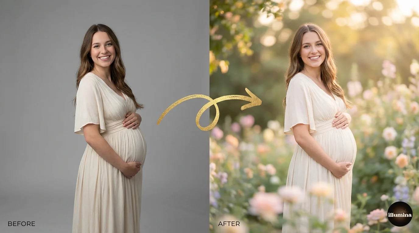
Illumina Backdrops offers curated packs of 50 high-resolution JPEG images (6000px+) across sports, maternity, floral, graduation, and studio themes. Each pack includes both portrait and landscape orientations so you're covered regardless of how you shot the subject.
Common use cases
Sports photography (baseball, basketball, soccer, football) dominates the digital backdrop market. But maternity photographers use them heavily too, placing expecting mothers in ethereal garden and studio scenes. Graduation portraits, dance recitals, pet photography, and holiday mini sessions all benefit from the same approach.
Color Matching and Making It Look Real
This section is the difference between a composite that fools the eye and one that looks like a school project collage. Every professional compositor will tell you: extraction is 30% of the work. Color matching and integration is the other 70%.
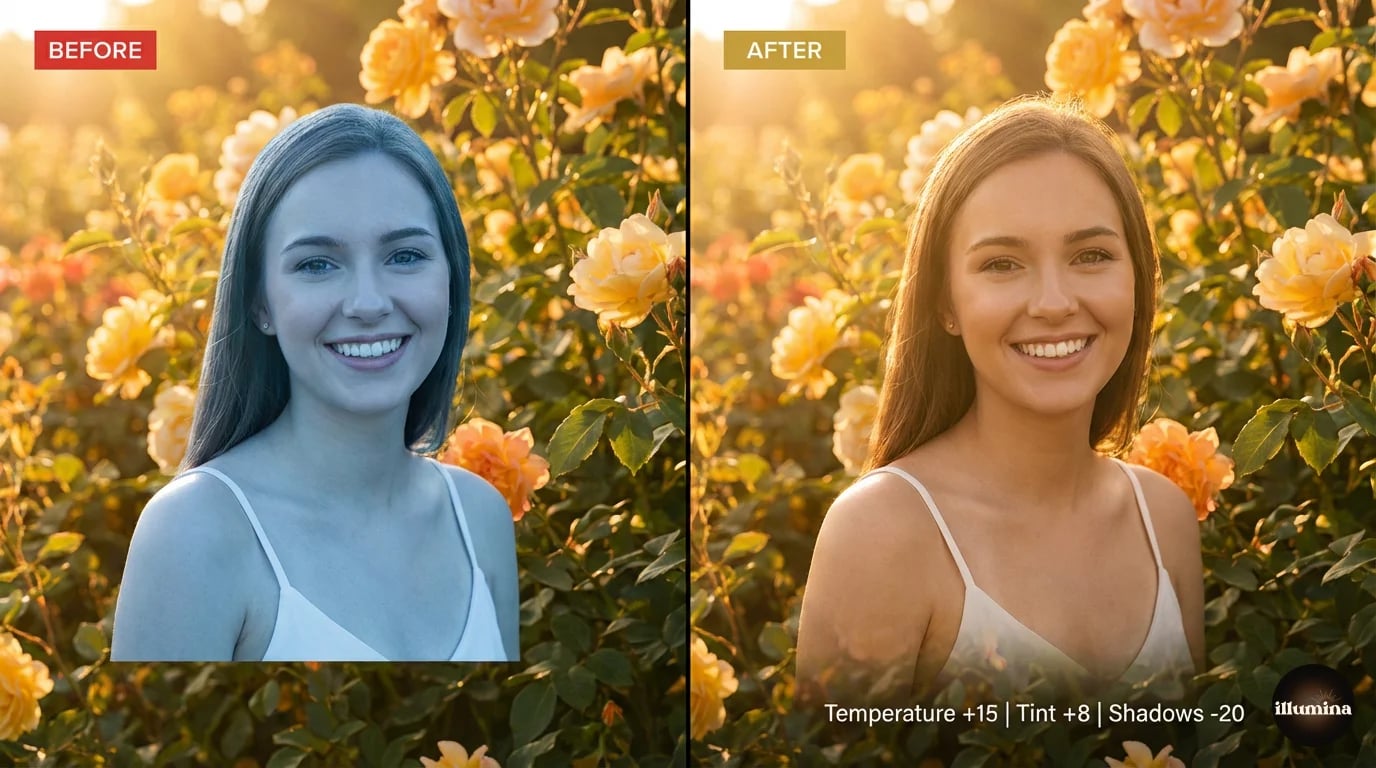
Temperature matching
Every light source has a color temperature. Daylight is cool and blue around 5500K. Tungsten lights are warm and orange around 3200K. Golden hour is somewhere in between, leaning warm. If your subject was photographed under cool studio strobes and your backdrop is a warm sunset scene, the mismatch will be obvious even to people who can't articulate why it looks wrong.
In Photoshop, a Color Balance adjustment layer handles this. Push midtones warmer or cooler to match. In Canva, the Warmth slider does the same thing less precisely. In Lightroom or Camera Raw, the Temperature slider gives you fine control before you even start compositing.
Shadow direction and consistency
Look at where light hits surfaces in the backdrop. Windows, lamps, the sun, studio lights: they all cast shadows in a specific direction. Your subject's shadows need to agree. If the backdrop shows light coming from the right side, but your subject was lit from the left, the composite will feel wrong even if you can't immediately pinpoint why.
When shooting specifically for compositing, take note of where the light falls in your chosen backdrops and match your studio lighting setup accordingly. This prevents the problem at the source rather than trying to fix it in post.
Contrast and tonal range
A high-contrast, punchy subject sitting on a soft, muted backdrop looks jarring. So does a flat, low-contrast subject on a dramatic, contrasty background. Match the tonal range. If the backdrop is moody with deep blacks, crush your subject's shadows slightly too. If the backdrop is light and airy, lift your subject's shadows and reduce contrast.
The unified color grade trick
Here's the single most effective technique for making composites look cohesive. After you've done your layer-by-layer adjustments, add one final adjustment layer on top of everything: a Color Lookup Table (LUT), a Photo Filter, or a Curves adjustment that shifts the entire image in one direction.
This works because it forces the backdrop and subject to share the same color bias. Even if your matching isn't perfect, a unified grade smooths over small inconsistencies. It's the same technique colorists use in film to make footage from different cameras look like it belongs together.
Edge blending
The boundary between subject and backdrop is where composites succeed or fail. After extraction, the edge often looks too sharp, too perfect. Real photos don't have razor-crisp boundaries between foreground and background because of lens optics and atmospheric effects.
A 0.5-1 pixel Gaussian blur on the layer mask softens the edge just enough. You can also paint on the mask with a soft, low-opacity brush to manually blend specific areas. The base of the subject (feet, bottom of clothing) usually needs the most blending work since that's where subject meets ground.
Common Mistakes (and How to Fix Them)
Even experienced editors make these errors. Knowing what to look for saves hours of frustration.
Floating subjects
The most obvious composite mistake. The subject appears to hover above the ground with no connection to the surface beneath them. Fix it by adding a contact shadow (soft, dark, concentrated right where the feet meet the ground) and making sure the subject's baseline aligns with a natural ground plane in the backdrop.
Wrong scale
A subject that's too large for the environment looks like a giant standing in a toy scene. Too small and they look lost. Use reference points in the backdrop (doors, furniture, other human-scale objects) to calibrate your subject's size. When in doubt, err slightly smaller. Slightly undersized looks more natural than oversized.
Mismatched lighting direction
Your subject was lit from the left. The backdrop's light comes from the right. Now the highlights and shadows contradict each other and the brain reads it as "fake" even before consciously analyzing it. You can flip your subject horizontally in Photoshop (Edit, Transform, Flip Horizontal) if the lighting direction is opposite. Just make sure any text on jerseys or uniforms isn't reversed.
Harsh, obvious edges
A subject with hard, aliased edges pasted onto a backdrop looks like a sticker. This usually means the extraction was too aggressive. Go back to the layer mask and feather the edges slightly. The Refine Edge Brush in Photoshop's Select and Mask workspace is designed for exactly this.
Ignoring atmospheric perspective
In real photos, distant objects appear slightly hazier, lower in contrast, and cooler in tone than near objects. If your backdrop shows depth (a field stretching into the distance, a hallway receding), your subject in the foreground should be the sharpest, most contrasty element. Failing to account for this makes the composite feel flat.
Over-editing
There's a temptation to keep tweaking. More shadow. More color correction. More sharpening. More blur. At some point, the edits start fighting each other and the image looks overprocessed. Once it looks right at 100% zoom, stop. Step away for ten minutes, come back with fresh eyes, and make one final pass. That's usually enough.
Which Method Should You Use?
It depends on what you're doing and how much time you have.
Quick social media post or personal project: Canva or PhotoRoom. Upload, layer, adjust, done. Five minutes or less.
Product photos for your online store: PhotoRoom's batch processing or Canva Pro. Consistency matters more than perfection for product listings, and these tools deliver both speed and decent quality.
Professional client work (portraits, sports, events): Photoshop, every time. The Curves adjustments, layer masks, shadow painting, and precise color control make the difference between a composite that looks like a photo and one that looks like clip art. Pair Photoshop with high-resolution digital backdrop packs and the results are indistinguishable from on-location photography.
On the go, phone only: PhotoRoom's mobile app. It won't match desktop quality, but it's the best you'll get on a phone screen.
Background removal gets all the attention, but adding the new background is where the real craft lives. A perfectly extracted subject on a poorly matched background still looks bad. Spend as much time on integration as you do on extraction, and your composites will be dramatically better for it.
Transform Your Photos
Give Your Photos the Wow Factor
Browse our collection of premium digital photo backdrops. 50 high-resolution print-ready backgrounds in each pack. Instant download.
Browse Backdrops

