

In this guide
- The Quick Answer
- What Compositing Is (And Why Canva Can Do It)
- Step 1: Remove the Background
- Step 2: Choose Your Backdrop
- Step 3: Scale and Position
- Step 4: Color Match the Subject to the Scene
- Step 5: Add Depth with Shadows
- Step 6: Add Finishing Touches
- Step 7: Multiple Subjects and Group Composites
- Step 7: Export
- Canva Free vs Canva Pro for Compositing
- When Canva Isn't Enough
- Backdrops That Are Built for Compositing
The Quick Answer
You don't need Photoshop to create composite photos. Canva can handle background removal, layering, blending, and export in one browser tab. It won't give you the same edge precision as Photoshop (especially on hair), but for social posts, marketing materials, cards, and portfolio mockups, it's more than good enough. And it's free to start.
This guide walks through the full compositing workflow in Canva from start to finish: removing the background, placing your subject on a new backdrop, adjusting color and sizing, and exporting a clean final image. If you've been putting off compositing because Photoshop feels like too much, this is your way in.

What Compositing Is (And Why Canva Can Do It)
Compositing is just placing a cutout of a person or object onto a different background. Photographers do it constantly. Shoot a kid in the studio, remove the backdrop, drop them into a stadium or a forest or a holiday scene. The result looks like the photo was taken on location, even though the subject never left the studio.
Canva wasn't built for this. It was built for designing social graphics, presentations, and flyers. But somewhere along the way, Adobe-level features crept in: background removal, layer ordering, transparency, blending, shadows, and image adjustments. It's not pixel-perfect like Photoshop, but for the 80% of compositing work that doesn't need pixel-level control, it does the job.
The biggest advantage Canva has over Photoshop for casual users is speed. There's no learning curve for layers, masks, or selection tools. You drag things around, click buttons, and what you see is what you get. A composite that would take a Photoshop beginner an hour takes about ten minutes in Canva once you know where the tools are.
Step 1: Remove the Background
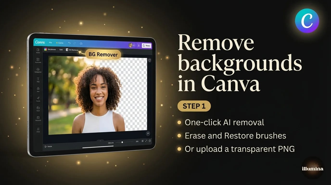
Open Canva and create a new design. The size depends on where the composite is going. For Instagram, use 1080x1080. For a print, use a custom size at your target dimensions. For general use, 1920x1080 works well.
Upload your subject photo (the person or object you want to cut out). Drag it onto the canvas, click on it, then go to Edit Image in the top toolbar. Find Background Remover in the effects panel. One click and Canva strips the background. You'll see the subject floating on the checkered transparency pattern.
The result is usually clean on subjects with clear edges. Shoulders, arms, clothing, solid outlines. Where it struggles is hair. Flyaway strands, curly edges, frizzy textures. Canva's AI tends to chop those off rather than preserve them. For a social post, you won't notice. For a large print or a close crop on the face, you might.
If the remover grabbed too much or too little, you can use the Erase and Restore brushes that appear after removal. Erase lets you paint away areas that should be transparent. Restore brings back areas the AI accidentally removed. The brushes are basic compared to Photoshop's Refine Edge, but they handle most cleanup jobs.
What If You Already Have a Transparent PNG?
If you've already made your cutout in another tool (Photoshop, remove.bg, Photoroom, or even the iPhone Lift Subject trick), just upload the transparent PNG directly to Canva. It'll import with the transparency intact. Skip the Background Remover entirely and go straight to placing it on your backdrop. This is what I do most of the time. I'll cut out in Photoshop where I can get clean hair edges, save as PNG, then build the final layout in Canva because the design tools are faster.
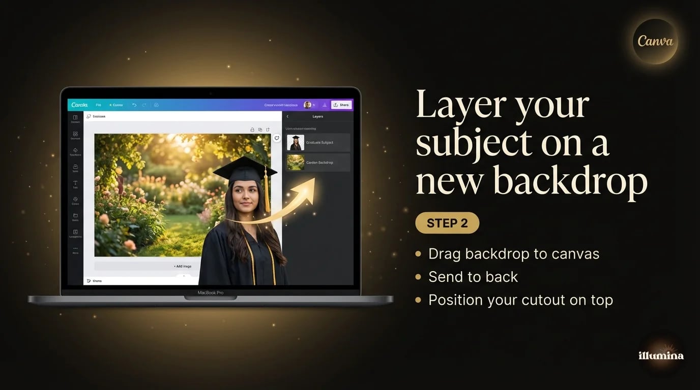
Step 2: Choose Your Backdrop
Now you need a background. You've got a few options.
Canva's built-in library has thousands of stock photos you can use as backdrops. Search for "studio background," "forest," "brick wall," whatever matches your concept. Drag one onto the canvas and it'll fill the frame. Then right-click your backdrop image and choose "Send to back" (or use the Position panel) so it sits behind your cutout subject.
Stock photos work for quick mockups, but they're generic. Everyone using Canva has access to the same library, so your composite won't stand out. For client work or anything you want to look distinctive, use a dedicated backdrop.
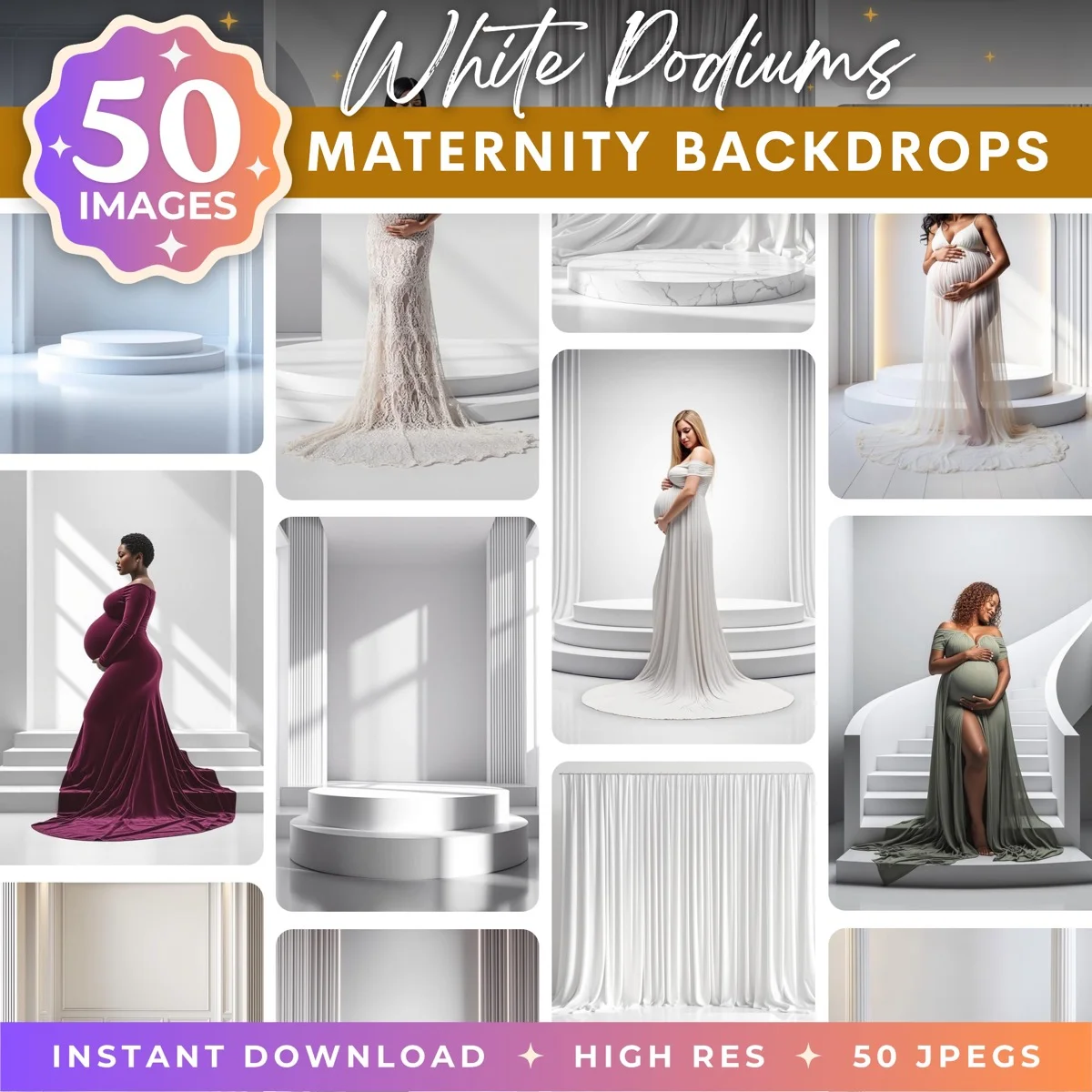
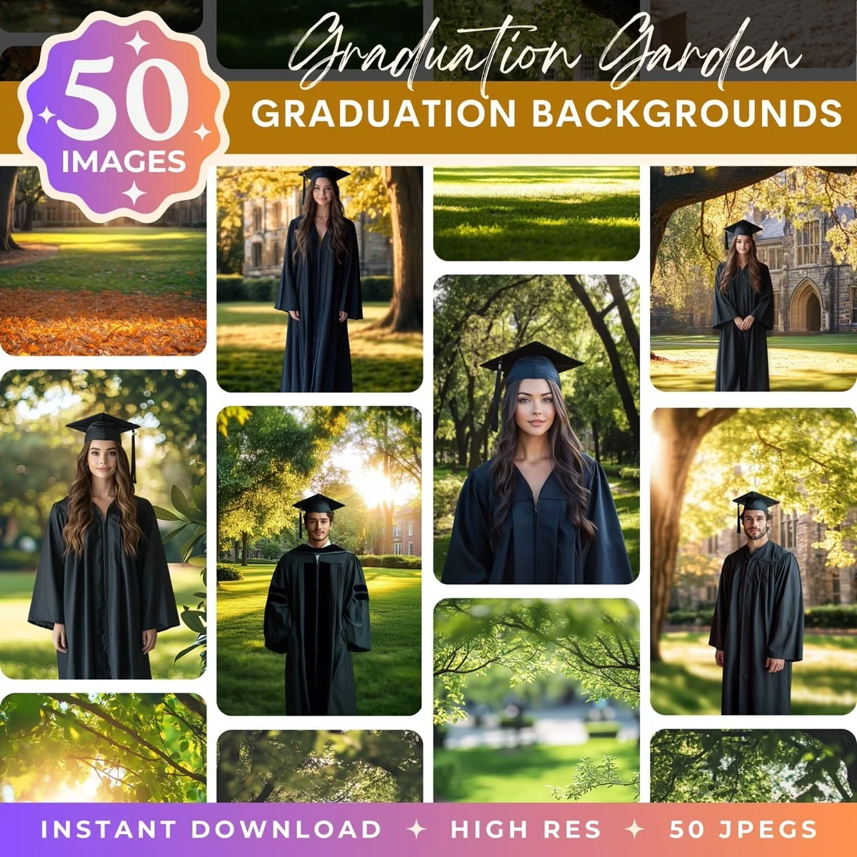
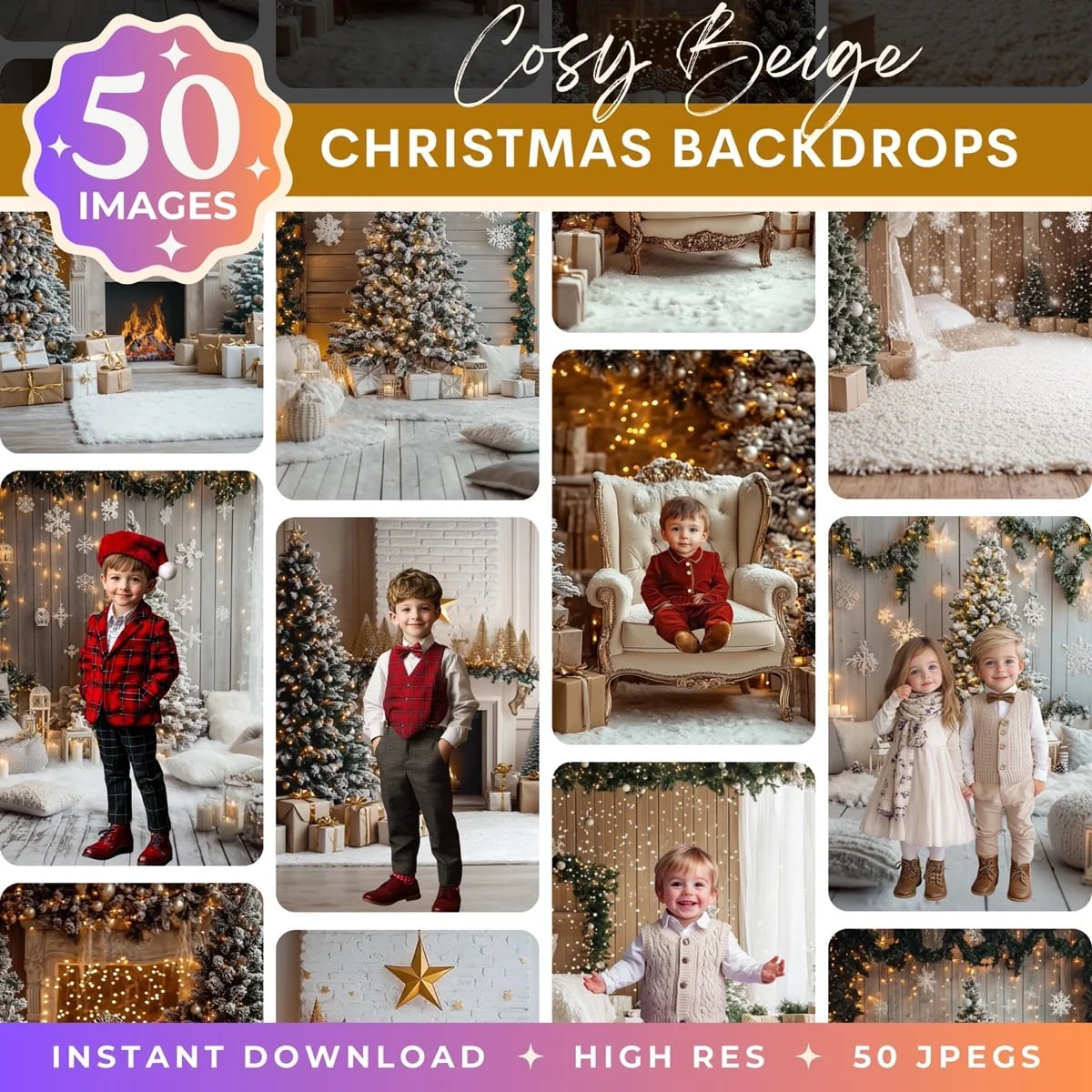
This is where purpose-built digital backdrops are worth it. Unlike random stock photos, they're designed with compositing in mind. The lighting direction, perspective, color temperature, and scale all match how portrait subjects are typically shot. A stock photo of a forest was photographed for the forest. A compositing backdrop of a forest was built for the person you're about to drop into it. The difference shows up in how natural the final composite looks.
Upload your backdrop image to Canva, drag it onto the canvas, send it to back. Your cutout subject should now be floating on top of the new scene.
Step 3: Scale and Position
This is where most beginners' composites fall apart. The subject is either too big for the scene, too small, placed at the wrong height, or floating above the ground line.
Click on your cutout subject and drag the corner handles to resize. Hold Shift while dragging to keep the proportions locked. Position the subject so their feet (or lower body) sit at a natural ground line in the backdrop. If the backdrop is a room, the feet should be on the floor. If it's an outdoor scene, they should be standing on the ground, not hovering above it.
Pay attention to scale. If your backdrop shows a wide landscape and your subject fills 80% of the frame, they look like a giant. If they're tiny in the corner, they look pasted in. Look at the environment cues in the backdrop. Where would a real person be standing? How tall would they appear from that camera angle? Match that.
A common trick: if the backdrop has furniture, a doorway, or other objects with known sizes, use those as a scale reference. A person should be roughly the same height as a standard doorframe (about 6.5 feet). If they're twice the height of the door, shrink them down.
Look at head sizes to check scale. In a group standing at roughly the same distance from camera, heads should be about the same size. If one person's head is noticeably bigger, they were photographed closer and need to be scaled down.
Step 4: Color Match the Subject to the Scene
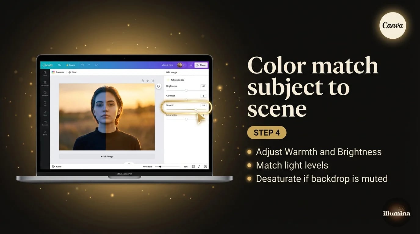
This is the step that separates a decent composite from one that looks obviously fake. Your subject was photographed under specific lighting conditions. The backdrop has different lighting. If you don't adjust, the subject will look pasted on because the color temperature, brightness, and contrast don't match.
Click on your cutout subject, then go to Edit Image and open the Adjust panel. You'll see sliders for Brightness, Contrast, Saturation, Tint, Warmth, and more.
Start with Warmth. If the backdrop has warm golden tones and your subject was shot under cool fluorescent light, push the Warmth slider right to add warmth until the skin tones feel like they belong in the scene. If the backdrop is cool and blue (winter, overcast day) and your subject is warm, pull Warmth left.
Then adjust Brightness. If the backdrop is a bright outdoor scene and your subject was shot in a dim studio, bump the subject's brightness up. If the backdrop is moody and dark, bring the subject's brightness down. The goal is for the light levels to feel consistent. Your eye picks up mismatches instantly even if you can't articulate why something looks off.
Contrast and Saturation usually need smaller adjustments. Slightly desaturate the subject if the backdrop has muted tones. Bump saturation if the backdrop is vivid. Match the energy, not the exact numbers.
I won't pretend Canva's adjustment tools are as precise as Photoshop's Curves or Color Balance. You can't target shadows and highlights independently. But for the kind of composites most people are making (social posts, cards, portfolio pieces), the basic sliders get you 90% of the way there.
Start with Warmth, then Brightness. These two sliders do most of the heavy lifting for color matching. Get the temperature right first, then match the light levels. Contrast and Saturation are fine-tuning.
Transform Your Photos
Give Your Photos the Wow Factor
Browse our collection of premium digital photo backdrops. 50 high-resolution print-ready backgrounds in each pack. Instant download.
Browse Backdrops
Step 5: Add Depth with Shadows
A subject with no shadow looks like a sticker. Adding even a subtle shadow grounds them in the scene and makes the composite feel three-dimensional.
Click on your cutout subject. In the Edit Image panel, look for the Shadow effect. Canva offers a drop shadow that you can adjust for offset, blur, transparency, and color. For most composites, use a dark shadow (black or very dark brown) with high blur, low offset, and about 30-40% transparency. This creates a soft, diffused shadow that suggests ambient light without looking harsh.
If the backdrop has a strong directional light source (window on the left, sunset from the right), offset the shadow in the opposite direction. Light from the left means the shadow falls to the right. The shadow angle should be consistent with every other shadow in the backdrop image.
When in doubt, go more subtle. A heavy dark shadow looks worse than no shadow at all. The shadow should be something the viewer doesn't consciously notice but would miss if it weren't there.
If you can see shadows of trees falling to the left in the scene, your subject's shadow should fall the same direction.
Don't overdo it. A heavy, dark, sharp shadow looks worse than no shadow at all. When in doubt, go more subtle. The shadow should be something the viewer doesn't consciously notice but would miss if it weren't there.
Step 6: Add Finishing Touches
Once your subject is placed, scaled, color-matched, and shadowed, a few optional touches can push the composite further.
A slight blur on the backdrop can simulate depth of field, making your subject pop. In Canva, click the backdrop image, go to Edit Image, and apply a light Blur. Keep it subtle. Too much and it looks like a phone's fake bokeh mode. Just enough to soften the background details slightly behind the subject.
If you want to add text, graphics, or a logo, do it now while everything is layered. Canva's text and element tools are where it really shines compared to Photoshop. Adding a title, a date, a watermark, or a border takes seconds.
For portfolio or marketing use, consider adding a thin vignette by placing a semi-transparent radial gradient element on top of everything. This draws the eye toward the center and gives the composite a polished, editorial feel. Canva doesn't have a built-in vignette tool, but you can fake it with a transparent oval shape set to black at about 10% opacity and stretched to cover the canvas.
Step 7: Multiple Subjects and Group Composites
If you're compositing more than one person into a scene, repeat steps 1-5 for each subject. Upload each photo separately, remove their background individually, and layer them onto the same backdrop. Use the Position controls (or right-click, Send Forward/Backward) to arrange who's in front of whom.
The tricky part with groups is getting everyone to the same scale. If one person was photographed closer to the camera than another, they'll look different sizes even though they're the same height in real life. Zoom in and compare the head sizes. In a group standing at roughly the same distance from the camera, heads should be about the same size. Adjust until it feels natural. It takes some eyeballing, but getting scale right is what separates a composite that works from one that looks like a ransom note.
Color matching also becomes more important with multiple subjects. If one person was shot under warm studio light and another under cool window light, they'll look like they're in two different photos even after you place them in the same scene. Adjust each subject's Warmth and Brightness individually before you finalize anything.
Step 7: Export
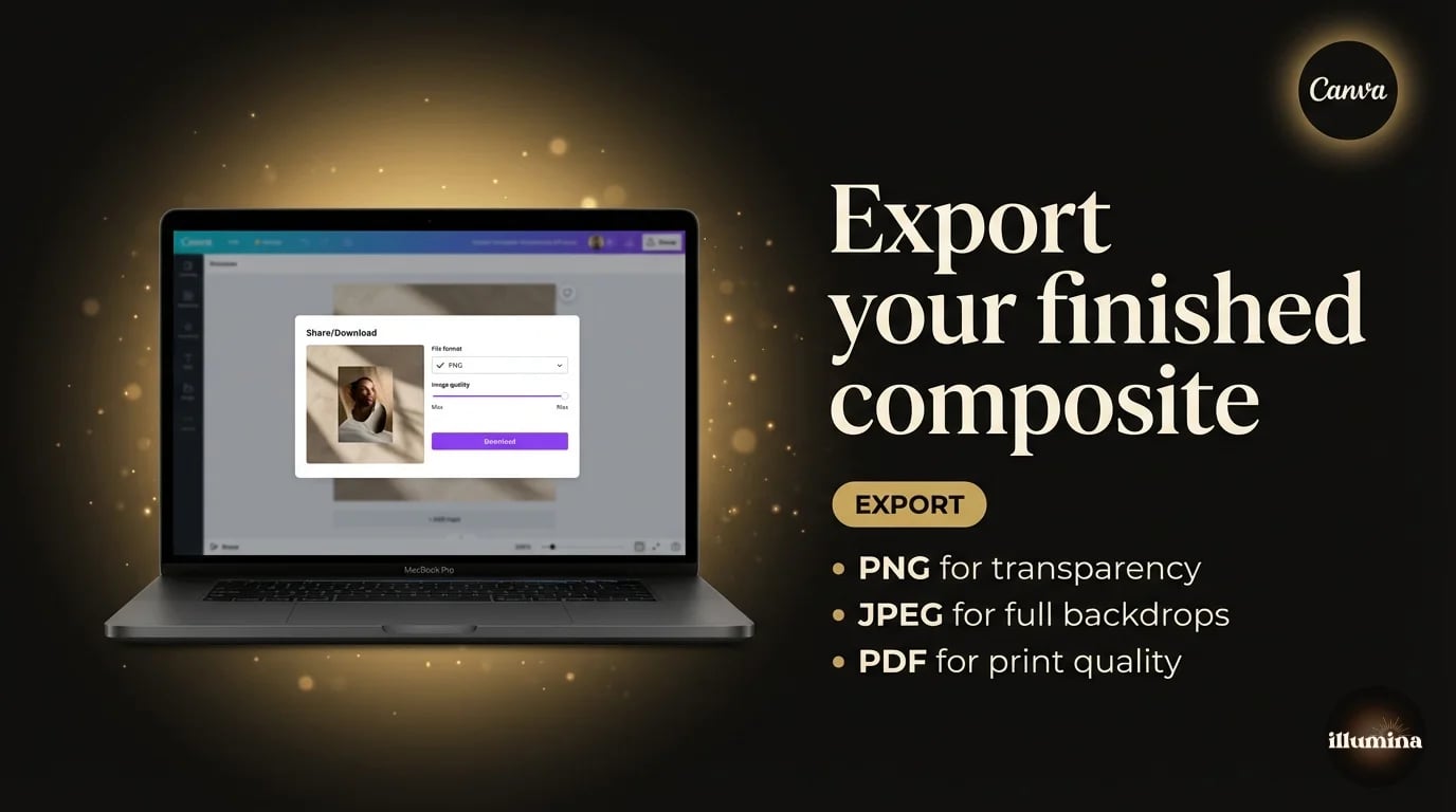
Click Share, then Download. For composites with no transparency needed (the final image has a full backdrop), JPEG at maximum quality works and gives you a smaller file. If you need transparency for any part of the image, use PNG and tick the Transparent Background checkbox.
For print work, download as PDF (Print quality). Canva embeds the images at their original resolution, which gives you a much better result than a rasterized PNG at screen resolution.
For social media, just use PNG at the default settings. Instagram, Facebook, and Pinterest all re-compress whatever you upload, so there's no point optimizing obsessively. Get the dimensions right for the platform (1080x1080 for Instagram feed, 1000x1500 for Pinterest, 1200x630 for Facebook/Open Graph) and let the platform handle the rest.
Canva Free vs Canva Pro for Compositing
The Background Remover is the main compositing feature locked behind Canva Pro. On the free plan, you get a limited number of removals per month (usually around 3-5). If you're doing one composite, free is fine. If you're doing this regularly, Pro is $13/month and includes unlimited background removal plus a much larger stock library.
Everything else in this workflow (layering, positioning, adjustments, shadows, blur, export) works on the free plan. So if you're uploading your own pre-cut transparent PNGs and your own backdrops, you can composite entirely for free.
One workaround if you don't want Pro: use a free tool like remove.bg or the iPhone Lift Subject trick to create your transparent cutout, then upload it to Canva Free. You skip the Background Remover entirely and get unlimited composites without paying anything.
When Canva Isn't Enough
I use Canva for quick composites and it handles most of my non-client work. But there are situations where it hits a wall.
Hair edges. Canva's Background Remover chops flyaway strands. For portraits where the hair is the focal point (bridal, maternity, senior portraits), this matters. Photoshop's Refine Edge or Channel selections will always do better here.
Precise color grading. Canva gives you global sliders. Photoshop gives you Curves, Levels, Hue/Saturation targeted by color range, and adjustment layers you can mask to affect only specific parts of the image. For serious compositing where the lighting difference between subject and backdrop is large, Canva's adjustments won't close the gap.
Multiple subjects. If you're compositing a family of five onto a new backdrop, each person needs individual sizing, positioning, and color adjustment. Canva can handle it, but it gets tedious. Photoshop's layer groups and linked adjustments make multi-subject composites much more manageable.
For a full breakdown of Photoshop's compositing workflow, see our guide on how to remove backgrounds in Photoshop. And for a comparison of every tool (Canva, Photoshop, free web tools, iPhone), check how to remove the background from any photo.
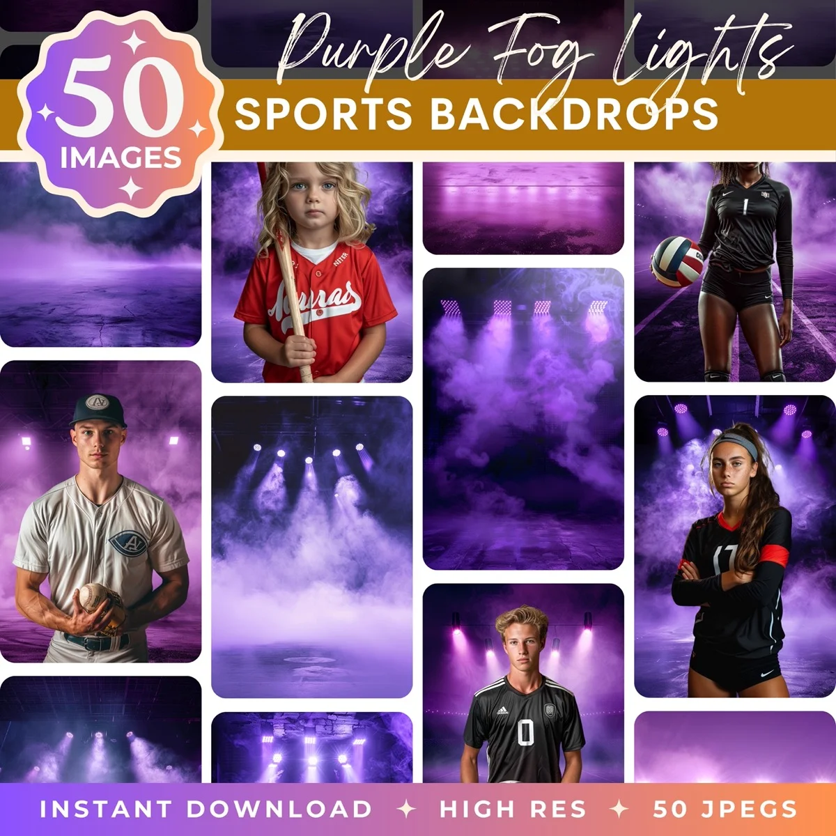
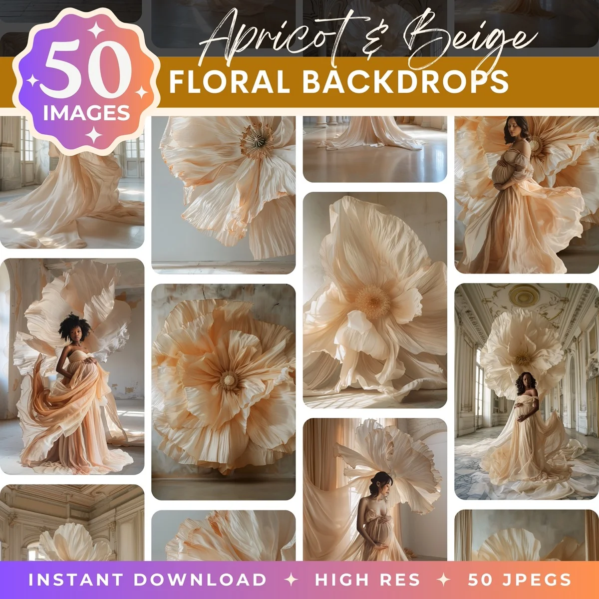
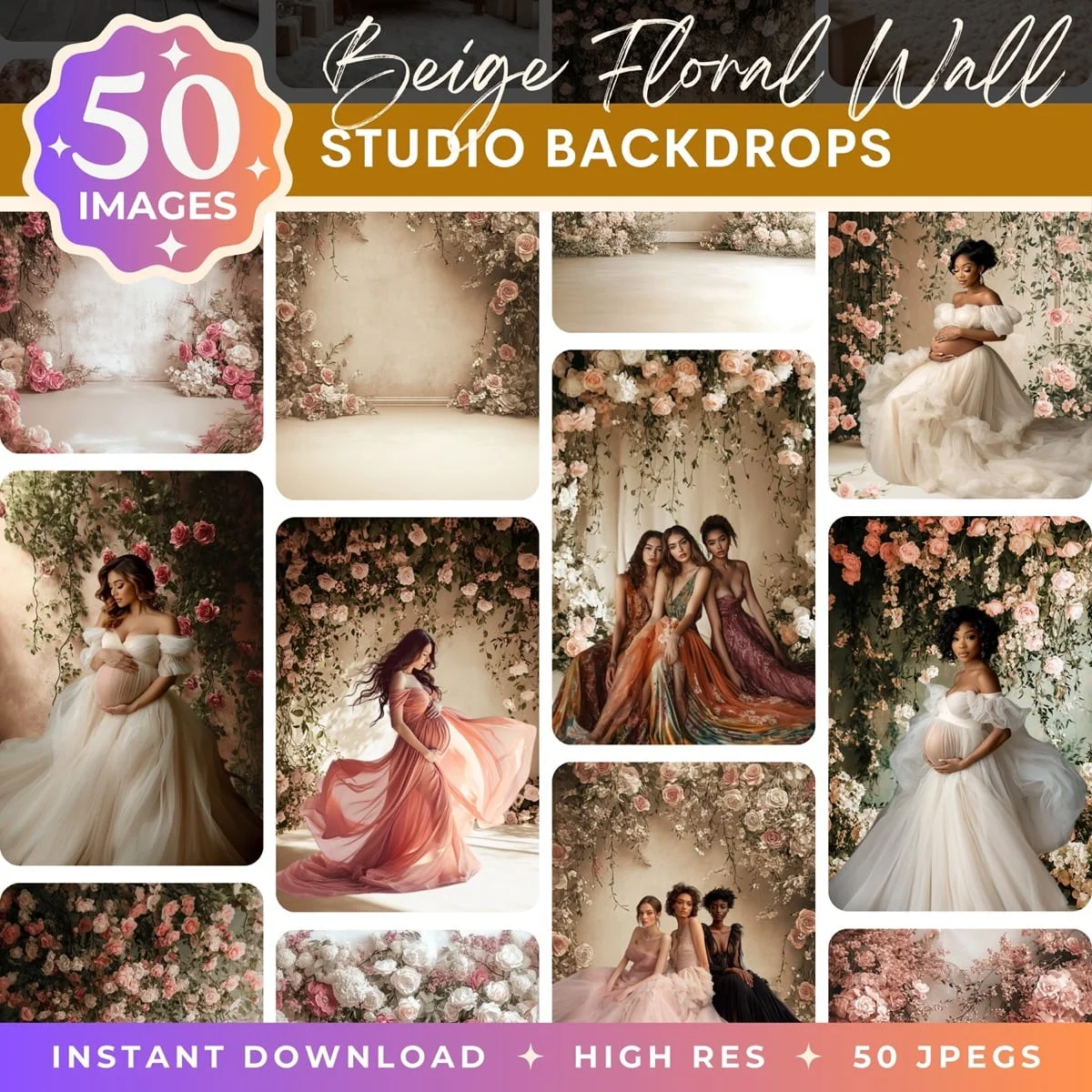
Backdrops That Are Built for Compositing
The backdrop you use makes or breaks the composite. A random stock photo of a park might work, but it wasn't designed for this. The camera angle is wrong, the lighting doesn't match studio flash, and the scale is off.
At Illumina Backdrops, every pack is built specifically for portrait compositing. The scenes are designed with the right perspective, lighting direction, and resolution to match how photographers typically shoot subjects. Drop your cutout in, adjust sizing, and the composite looks natural because the backdrop was engineered for exactly this.
Drag these into Canva and start compositing
Compositing in Canva isn't a compromise. It's a different tool for a different workflow. If you need speed and simplicity and your output is digital, it handles the job. Keep Photoshop in your back pocket for the tricky stuff, and use Canva for everything else.
Transform Your Photos
Give Your Photos the Wow Factor
Browse our collection of premium digital photo backdrops. 50 high-resolution print-ready backgrounds in each pack. Instant download.
Browse Backdrops

