

In this guide
- The Quick Answer
- Method 1: Select Subject + Solid Color Fill Layer
- Method 2: Hue/Saturation Adjustment (Change Existing Color)
- Method 3: Color Overlay with Blend Modes
- Method 4: Replace Color Command
- Method 5: Gradient Background
- Matching a Specific Brand Color
- Changing White Backgrounds to Color
- Changing Background Color in Camera Raw / Lightroom
- Batch Processing: Same Color Across Multiple Images
- When to Use a Scene Instead of a Solid Color
- Common Mistakes
The Quick Answer
Select the background with Select Subject (then invert), add a Solid Color fill layer below your subject, and pick your new color. That's the non-destructive way, and it takes about thirty seconds. For more complex scenarios like matching a brand color, creating a gradient, or swapping to an entirely different scene, this guide covers five methods from fastest to most flexible.
Everything here uses Photoshop, but if you don't have it, our Canva compositing guide covers a simpler workflow that handles solid color swaps and backdrop replacements without any Photoshop knowledge.
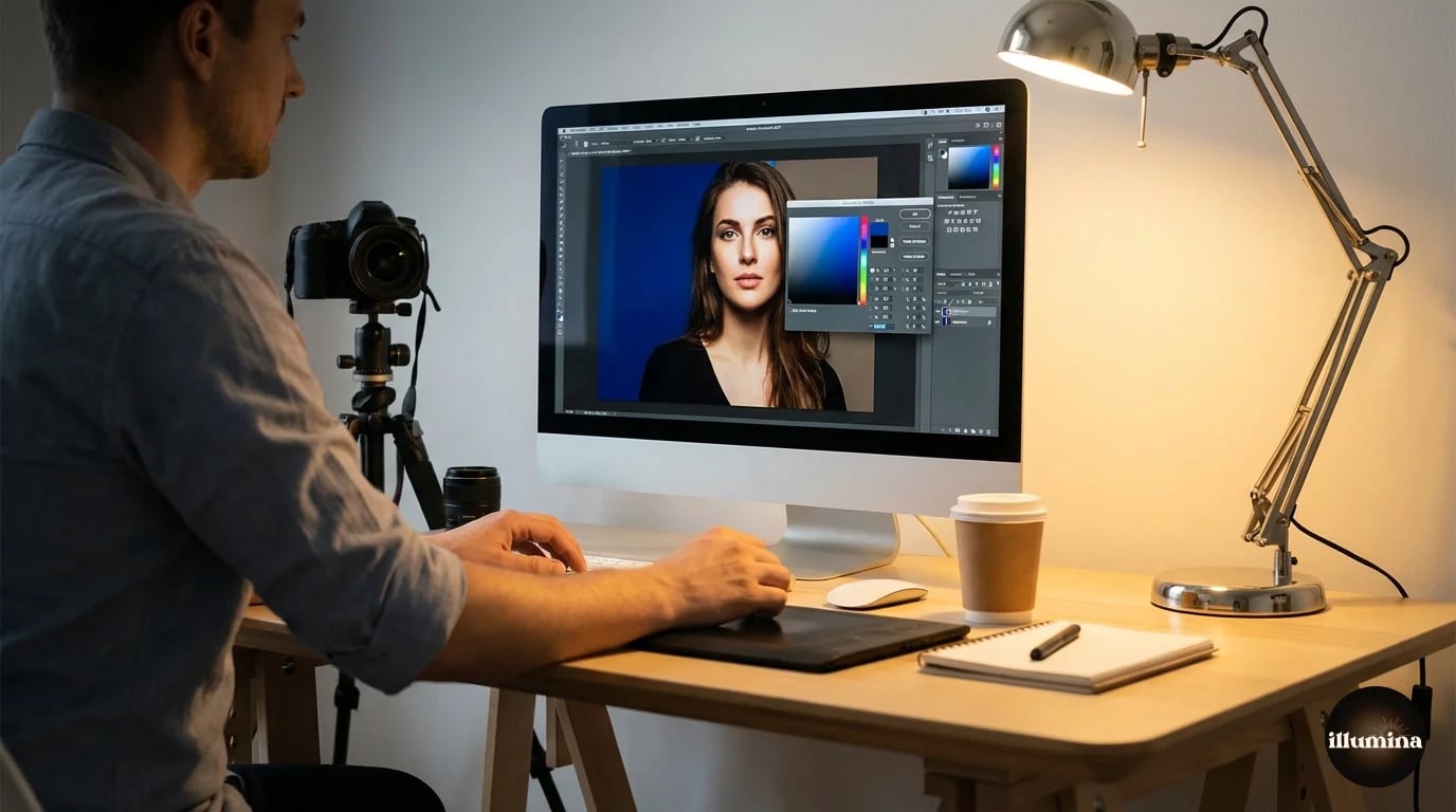
Method 1: Select Subject + Solid Color Fill Layer
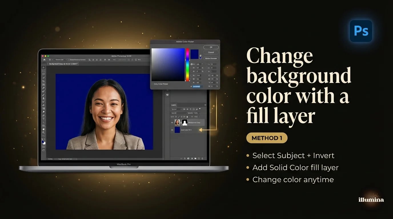
This is the method I use 90% of the time. It's fast, non-destructive, and you can change the color later without redoing anything.
Open your image. Go to Select, then Subject. Photoshop grabs the main subject. Now invert the selection: Select, then Inverse (or Cmd+Shift+I). This selects the background instead of the subject.
With the background selected, go to Layer, then New Fill Layer, then Solid Color. Pick your color from the color picker and click OK. Photoshop creates a fill layer with a mask that only shows the color behind your subject. The subject stays untouched on the original layer.
Want to change the color later? Double-click the fill layer's color swatch in the Layers panel. The color picker opens and you can pick a new color without reselecting anything. This is why fill layers are better than just painting the background. The selection is baked into the mask and the color is endlessly adjustable.
Always use a fill layer, not the Paint Bucket. The Paint Bucket permanently changes pixels. A fill layer is non-destructive, meaning you can change the color, adjust the mask, or delete the layer entirely without ever touching the original image.
Refining the Edge
If Select Subject left rough edges (especially around hair), the color change will show a halo where the old background peeks through. Fix this by clicking on the fill layer's mask, then going to Select and Mask. Use the Refine Edge brush along the hair line. The mask updates in real time and the color change follows. This is the same Refine Edge workflow from our Photoshop background removal guide, just applied to a fill layer mask instead of a transparency mask.
Method 2: Hue/Saturation Adjustment (Change Existing Color)
If you don't want to replace the background entirely but just shift its color (turn a blue wall teal, make a green lawn more golden, warm up a cool gray), a targeted Hue/Saturation adjustment is faster than reselecting.
Add a Hue/Saturation adjustment layer (Layer, New Adjustment Layer, Hue/Saturation). In the Properties panel, click the dropdown that says "Master" and select the color range of your current background. If the background is blue, select Blues. If it's green, select Greens.
Now move the Hue slider. The background color shifts while everything else stays the same. No selection needed. Photoshop is targeting only pixels in that color range. Adjust Saturation to intensify or mute the new color, and Lightness to darken or brighten it.
This method works best when the background is a distinct color that doesn't appear in the subject. If your subject is wearing the same color as the background, the hue shift will affect them too. In that case, paint black on the adjustment layer's mask over the subject to exclude them from the change.
You can also use the eyedropper tools in the Hue/Saturation dialog to fine-tune which colors are affected. Click the left eyedropper on the specific background color you want to shift. Then use the + eyedropper to add additional shades to the range. This gives you tighter control than just picking "Blues" from the dropdown, especially when the background has a mix of blue-gray and blue-green tones that span multiple preset ranges.
Method 3: Color Overlay with Blend Modes
This is a quick trick for adding a color wash to any background without making a precise selection. Create a new layer above your image. Fill it with your desired color (Edit, Fill, choose color). Then change the blend mode of the color layer to something like Multiply, Overlay, or Soft Light.
Each blend mode interacts with the underlying image differently. Multiply darkens and tints. Overlay adds color while preserving contrast. Soft Light is subtler and works well for gentle color grading. Lower the opacity of the color layer to taste.
To restrict the color to just the background, add a layer mask and paint black over the subject. This is less precise than Method 1 but it's useful when you want a colored tint rather than a flat solid color, because the original texture and lighting of the background show through the blend.
This technique is popular for social media graphics where you want a colored brand wash over a photo without it looking flat. A product photo with a Soft Light overlay of your brand color creates a cohesive look across your feed without every image having an identical solid background. It keeps the photo feeling like a photo while unifying the color palette.
Method 4: Replace Color Command
Image, Adjustments, Replace Color. This opens a dialog where you click on the background color with an eyedropper, adjust the Fuzziness slider to expand or contract the selection range, and then shift the Hue, Saturation, and Lightness of everything in that range.
It's similar to the Hue/Saturation method but wrapped in a single dialog with a visual preview. The downside is that it's destructive. It changes the actual pixels rather than adding an adjustment layer. I'd use this for quick proofs or one-off edits, not for client work where you might need to change the color again later.
Replace Color is destructive. Duplicate your background layer (Cmd+J) before using it so you always have the original to fall back on.
Method 5: Gradient Background
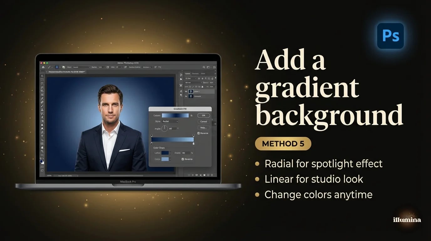
Solid colors are clean but sometimes a gradient looks more polished, especially for headshots and portraits. The process is almost identical to Method 1, just with a gradient fill instead of a solid color.
Select the subject, invert the selection, then go to Layer, New Fill Layer, Gradient. Choose your two colors, set the angle and style (linear, radial, or diamond), and adjust the scale. The gradient fills the background behind your subject.
Radial gradients centered behind the subject's head create a natural spotlight effect that draws the eye. Linear gradients from dark at the bottom to lighter at the top mimic studio lighting. Play with the angle and color stops until it looks right. Like the solid color fill, you can double-click the gradient layer anytime to change it.
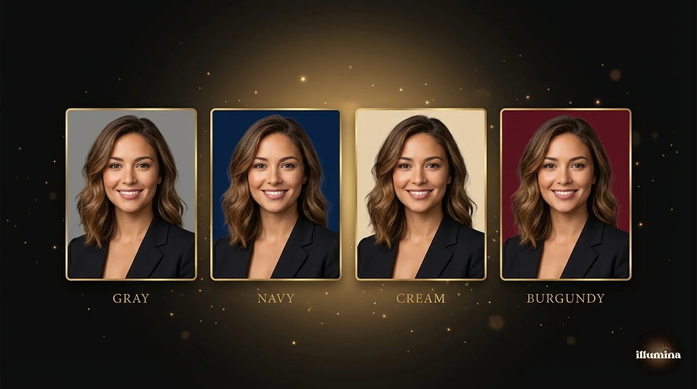
For photographers shooting corporate headshots, gradient backgrounds are a popular upsell. Shoot against gray, then offer the client their choice of gradient in post. One session, unlimited background options.
For graduation portraits, a radial gradient in the school colors (dark at the edges, lighter at center) creates a premium look that parents love. Set the gradient center point slightly above the subject's head so the lightest area draws the eye to the face. Two color stops are usually enough. Three or more starts looking busy unless you're going for a deliberate rainbow or sunset effect.
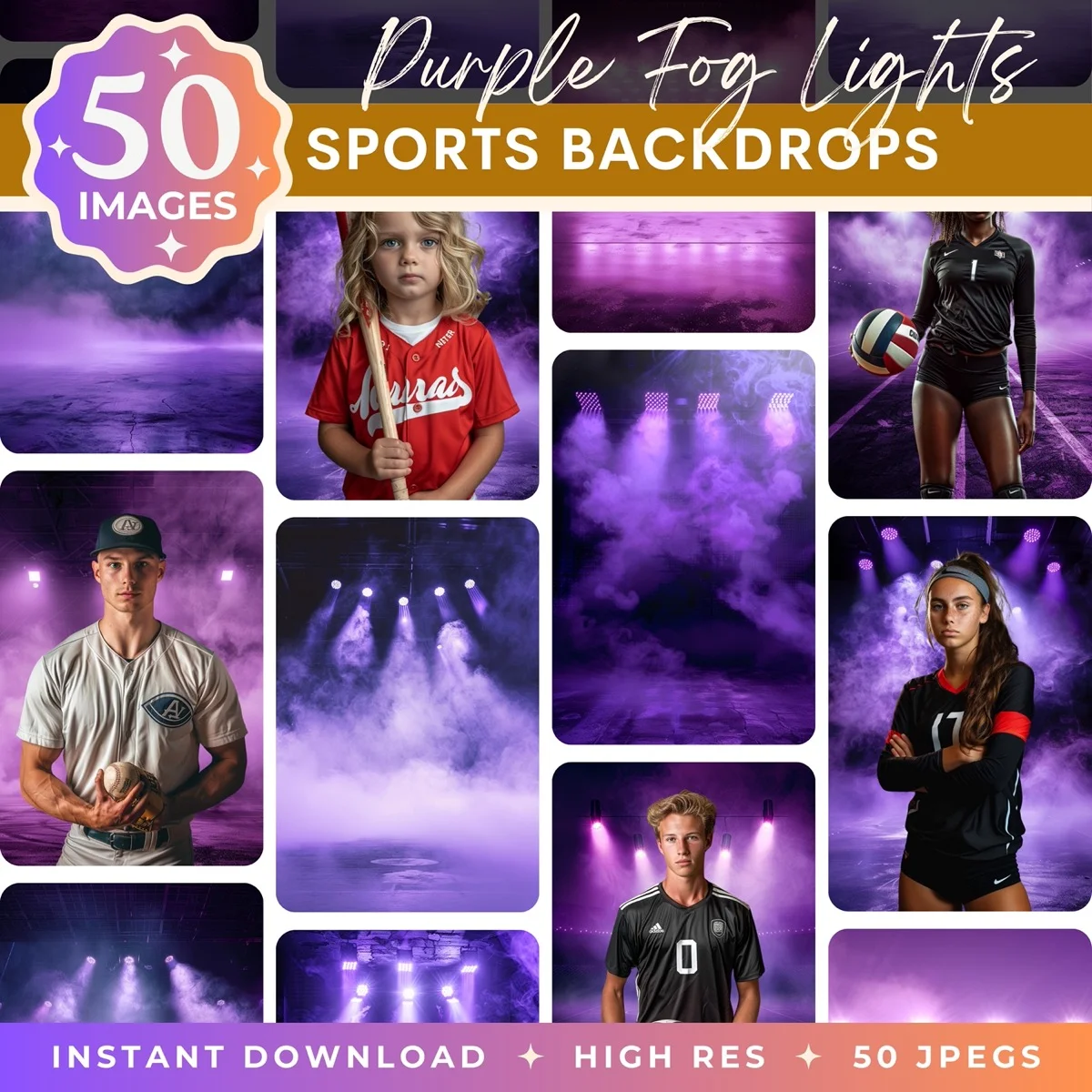
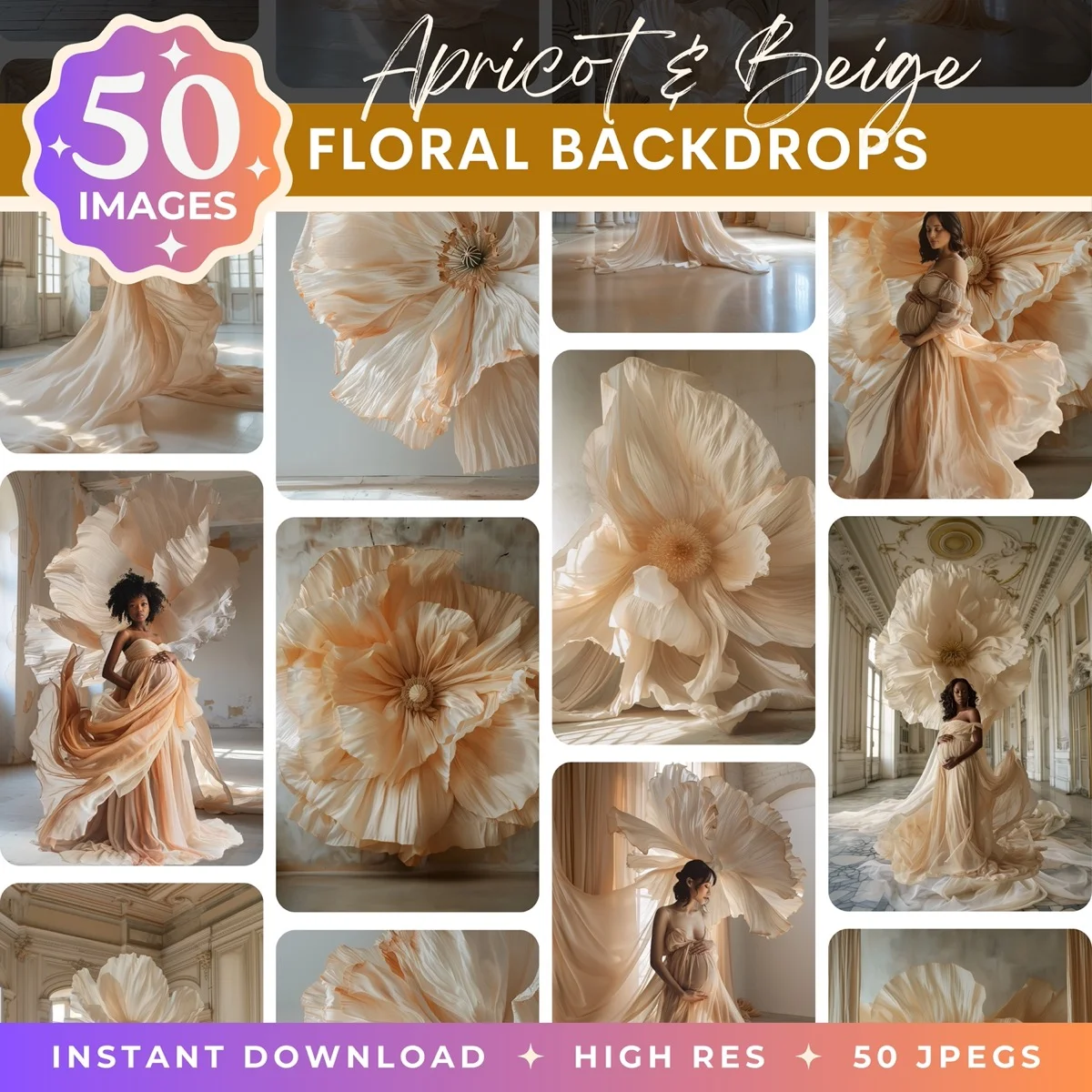
Transform Your Photos
Give Your Photos the Wow Factor
Browse our collection of premium digital photo backdrops. 50 high-resolution print-ready backgrounds in each pack. Instant download.
Browse Backdrops
Matching a Specific Brand Color
If a client gives you a hex code or Pantone reference, you need the background to match exactly. Here's how to nail it.
When the color picker opens (from Method 1 or Method 5), type the hex code directly into the # field at the bottom. For example, #1A1A2E for a deep navy or #F5E6CA for a warm cream. The fill layer will be that exact color.
For Pantone colors, Photoshop has a built-in Pantone library. In the color picker, click "Color Libraries" and search by Pantone number. This gives you the closest RGB equivalent, which is important because Pantone is a print color system and screen colors are RGB. The match is close but not identical. If exact Pantone accuracy matters (it usually does for print), calibrate your monitor and soft-proof the color before delivering.
One thing to watch: the subject's existing color cast affects how the new background color looks in context. A warm-toned subject on a cool blue background reads differently than the same blue next to a cool-toned subject. If the color looks "off" even though the hex code is correct, the issue is usually the interaction between the subject's warmth and the background's temperature. A subtle Curves adjustment clipped to the subject layer can bring them into harmony.
Changing White Backgrounds to Color
Product photographers and headshot photographers deal with this constantly. You shot on white, the client wants color. Or the white background isn't clean enough and needs to be replaced entirely.
If the white is clean and consistent, the Magic Wand tool (Tolerance 15-25, Contiguous unchecked) grabs it in one click. Invert, add your fill layer, done. This is the fastest path and works well when the white is pure white (blown out, no shadows).
If the white has shadows, gradients, or isn't perfectly even, use Select Subject instead. The AI handles the subject detection better than trying to define "white" when the white varies across the frame. Invert the selection and proceed with the fill layer.
For product photos specifically, the clean-white-to-color swap is a workflow you can batch with Photoshop Actions. Record the steps once (Select Subject, Invert, Solid Color Fill, choose color, flatten, export), then batch it across a folder of product shots. Twenty images, same color, five minutes.
Check the edges against the new color before delivering. White halos that were invisible against a white background become obvious against a dark or saturated color. Run Defringe (Layer, Matting, Defringe, 1px) after the swap to clean up any fringing.
Changing Background Color in Camera Raw / Lightroom
If you're working with RAW files and want to shift the background color before opening in Photoshop, Camera Raw and Lightroom's Masking tools can handle simple color changes.
In Camera Raw or Lightroom, click the Masking icon, then Select Background (available in recent versions). The AI selects the background automatically. With the mask active, shift the Hue, Saturation, and Luminance sliders to change the background color. The advantage of doing this in Camera Raw is that it's applied to the RAW data before any pixel-level processing, which means the color shift is higher quality and fully reversible.
The limitation is control. Camera Raw's masking isn't as precise as Photoshop's Select and Mask, especially on hair. For quick color shifts on well-separated subjects, it works. For anything complex, open in Photoshop.
Batch Processing: Same Color Across Multiple Images
If you're changing backgrounds on a set of headshots or product photos that all need the same color, recording a Photoshop Action saves hours. Open one image, hit Record in the Actions panel, run through your workflow (Select Subject, Invert, Solid Color fill, set color, Defringe), then stop recording. Now you can play that action on every other image in the set.
For fully automatic batch processing: File, Automate, Batch. Point it at your source folder, select your recorded action, set a destination folder, and let it run. Photoshop opens each image, runs the action, saves, and moves on. I've processed 200 headshots this way in under an hour. The AI selection isn't perfect on every image, so plan a quick review pass afterward to catch any masks that need manual cleanup.
For team headshot projects where every employee needs the same brand-color background, this workflow is a game-changer. Shoot everyone against gray in a 20-minute session, batch-process the color swap, and deliver a unified set. No reshoots, no scheduling conflicts, no inconsistent backgrounds.
When to Use a Scene Instead of a Solid Color
Solid colors and gradients are clean and professional, but sometimes they're too sterile. A portrait against a flat navy blue says "corporate ID badge." The same portrait composited onto a softly blurred office, a garden scene, or a textured wall says "editorial." The difference is context and warmth.
If you've mastered the background color change workflow in this guide, you already know how to do composites. The process is identical: select the subject, remove the background, place something new behind them. The only difference is that instead of a Solid Color fill layer, you're placing a photo or a digital backdrop. We cover the full compositing workflow in our Photoshop guide and our Canva compositing guide.
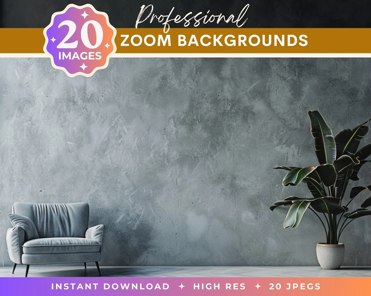
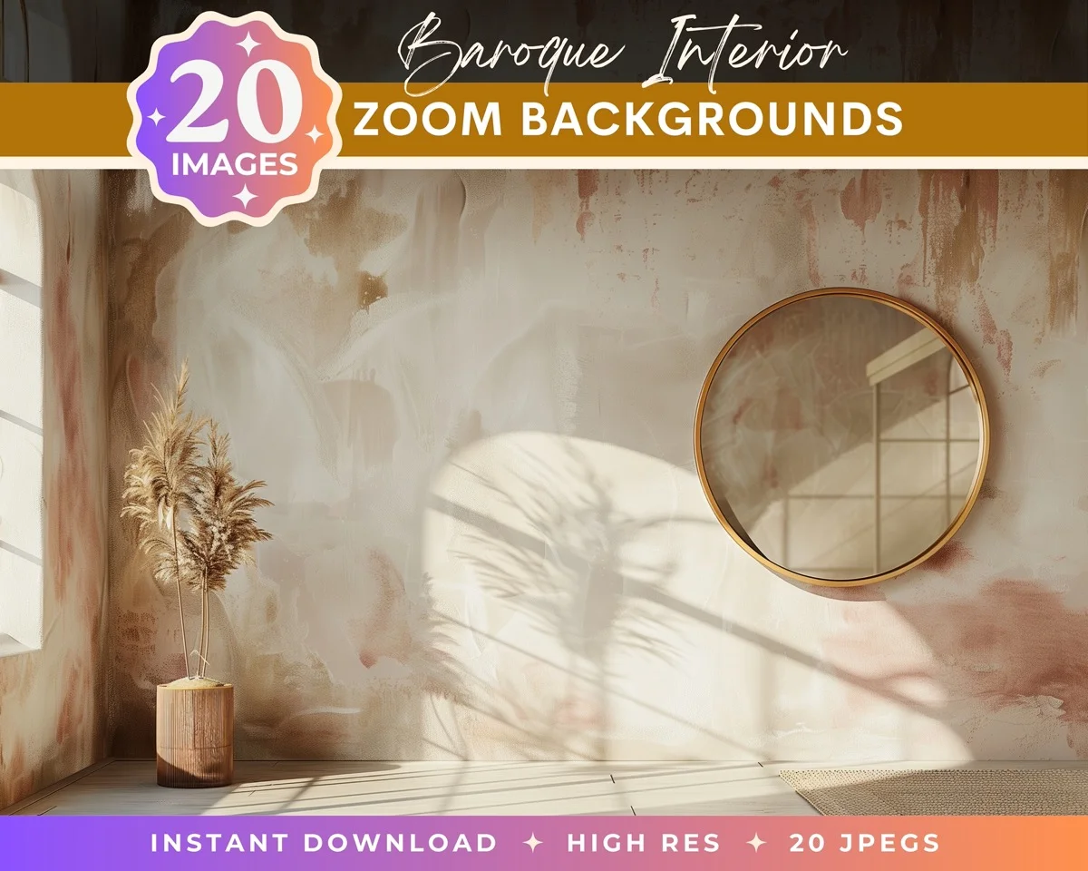
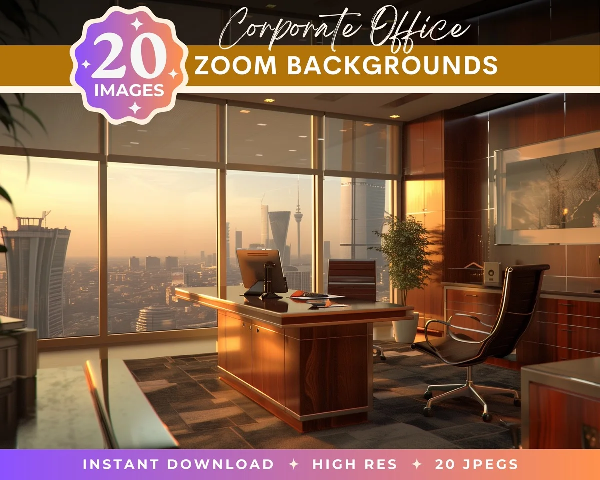
Digital backdrops designed for portrait work have the lighting and perspective pre-matched to how subjects are typically shot, which means the composite looks natural without extensive color grading. For photographers offering background swaps as a service, having a library of backdrop options alongside solid colors and gradients gives clients real variety from a single shoot.
Common Mistakes
Using the Paint Bucket on the background layer. This destroys the original pixels and you can't change the color later. Always use a fill layer.
Not refining the mask edges. A rough selection looks fine against a similar color but falls apart when the new color is very different from the original. Always check the edges after changing the color. Zoom to 100% and look at the hair line and clothing edges.
Ignoring the color interaction between subject and background. A warm subject on a cool background creates visual tension. Sometimes that's intentional (corporate authority). Sometimes it's a mistake (birthday portrait that feels clinical). If something looks off, adjust the subject's warmth to complement the new background.
Forgetting to check against the original background. If the subject had light spill from the original background (green wall casting green on the subject's skin), changing the background to blue doesn't remove the green cast on the skin. You'll need a separate Color Balance adjustment clipped to the subject layer to neutralize the old spill.
Over-saturating the new color. Solid saturated backgrounds look unnatural on screen and even worse in print. Real studio backdrops are usually muted, not neon. When in doubt, pull the saturation back 20% from where you think it should be.
Not saving a PSD with layers intact. Once you flatten and save as JPEG, the fill layers, masks, and original pixels are gone. Always save a layered PSD file before exporting a flat version. When the client comes back six months later wanting the background in a different color (they will), you'll be glad you kept the layers.
Go beyond solid colors with professional backdrop scenes
Changing a background color in Photoshop is one of those skills that seems simple until you need to do it well. The selection is the hard part. The color change itself is just picking from a swatch. Get the mask right, use fill layers instead of painting, and check your edges at 100% before you deliver. Everything else is just refining taste. And once it clicks, you'll find yourself offering background swaps as a service because it's one of the highest-value, lowest-effort upsells in portrait photography.
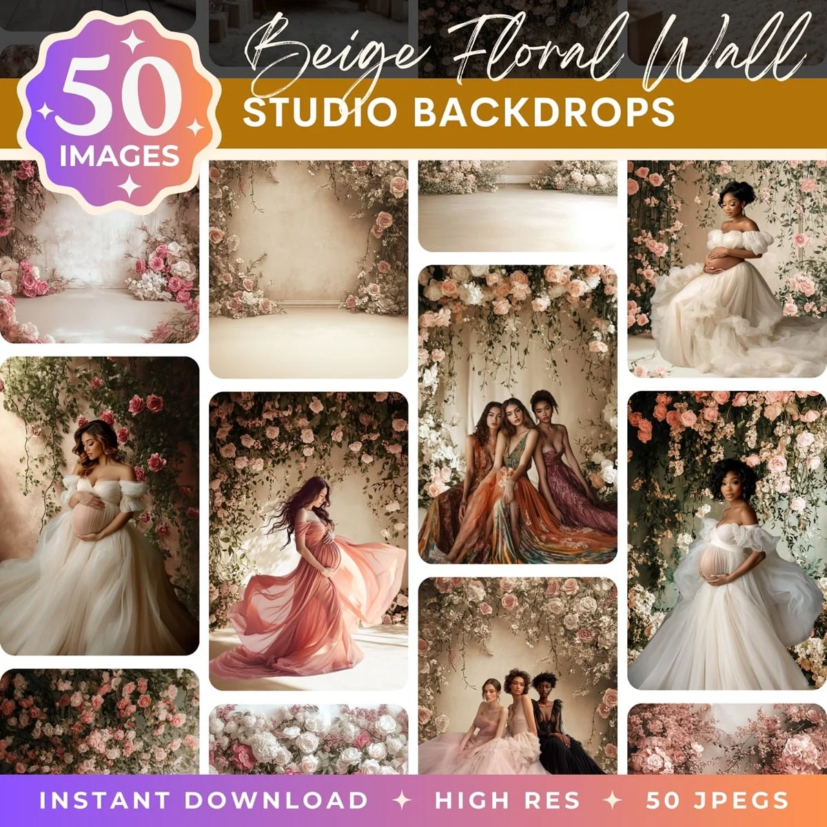
Transform Your Photos
Give Your Photos the Wow Factor
Browse our collection of premium digital photo backdrops. 50 high-resolution print-ready backgrounds in each pack. Instant download.
Browse Backdrops

