
In this guide
- The Quick Answer
- Step 1: Download and Open Your Backdrops
- Step 2: Take a Great Photo of Your Subject
- Step 3: Cut Out the Background Behind Your Subject
- Canva or Photoshop? Pick Your Path
- Adding Your Photo to a Backdrop in Canva
- Adding Your Photo to a Backdrop in Photoshop
- Matching the Lighting and Colours
- Presets: The Shortcut to a Polished Look
- Adding Overlays (Smoke, Fog, and Light)
- Saving and Downloading Your Finished Photo
- A Few Things That Make a Big Difference
- Quick Questions
- You've Got This
The Quick Answer
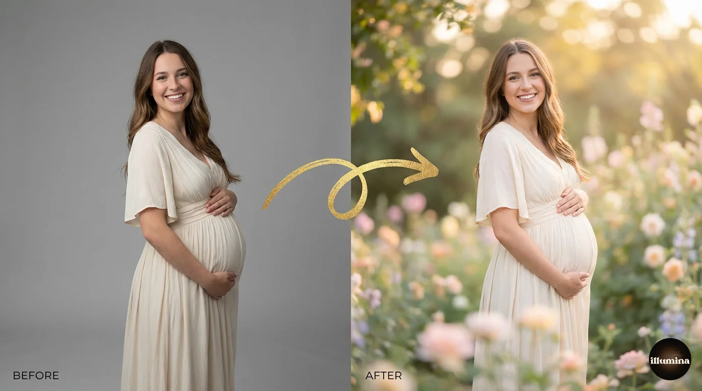
You bought a backdrop pack, you've downloaded the files, and now you want to drop your own photo onto one of those beautiful scenes. Here's the short version: take a clear photo of your subject, cut them out from their background, place them on top of one of your Illumina backdrops in Canva or Photoshop, nudge the colours so the two layers match, then save. That's the whole thing.
If you've never done this before, don't worry. The rest of this guide walks you through every step in plain language, with a Canva path for people who want easy and a Photoshop path for people who want control. And yes, you can do the entire Canva version on your phone, on the couch, for free. I'll flag the advanced tricks as we go so you can try them when you're ready, or skip them and still get a lovely result.
Here's the whole process in six steps:
- Download your backdrop files from the link in your order email.
- Take a photo of your subject against a plain wall in good light.
- Cut out the background so only your subject is left.
- Place your subject onto a backdrop in Canva or Photoshop.
- Match the brightness and colour so the two layers blend.
- Save and download your finished photo.
One promise up front: you do not need to be a designer for this. Stick to the Canva steps and you'll have a finished photo in about ten minutes.
Step 1: Download and Open Your Backdrops
When you buy a pack from us, your confirmation email has a Download Now button that takes you to your order page. Each pack has its own Download button that opens a Google Drive folder full of high-resolution images.
Inside that Drive folder, click Download all in the top-right corner to grab everything at once. The files arrive as a ZIP, which is just a compressed folder. Double-click it to unzip, and you'll see all your backdrops as individual image files. Save that folder somewhere you'll remember, like a "Backdrops" folder inside your Pictures. You only do this once per pack, and your download links never expire, so you can come back for them later.
Each pack includes both upright (portrait) and wide (landscape) versions of every scene. Pick the orientation that matches how you photographed your subject. If you photographed them standing up, reach for a portrait backdrop. Simple as that.
Quick note on file size: these images are big on purpose. A 6000-pixel backdrop is what lets you print a sharp 16x20 without it going fuzzy. Don't shrink them before you start. Work big, then export smaller at the end if you only need it for Instagram.
Step 2: Take a Great Photo of Your Subject
Here's the part most people skip, and then they wonder why their composite looks off. The quality of your final image is decided before you ever open an editor. A clean, well-lit photo of your subject is most of the battle.
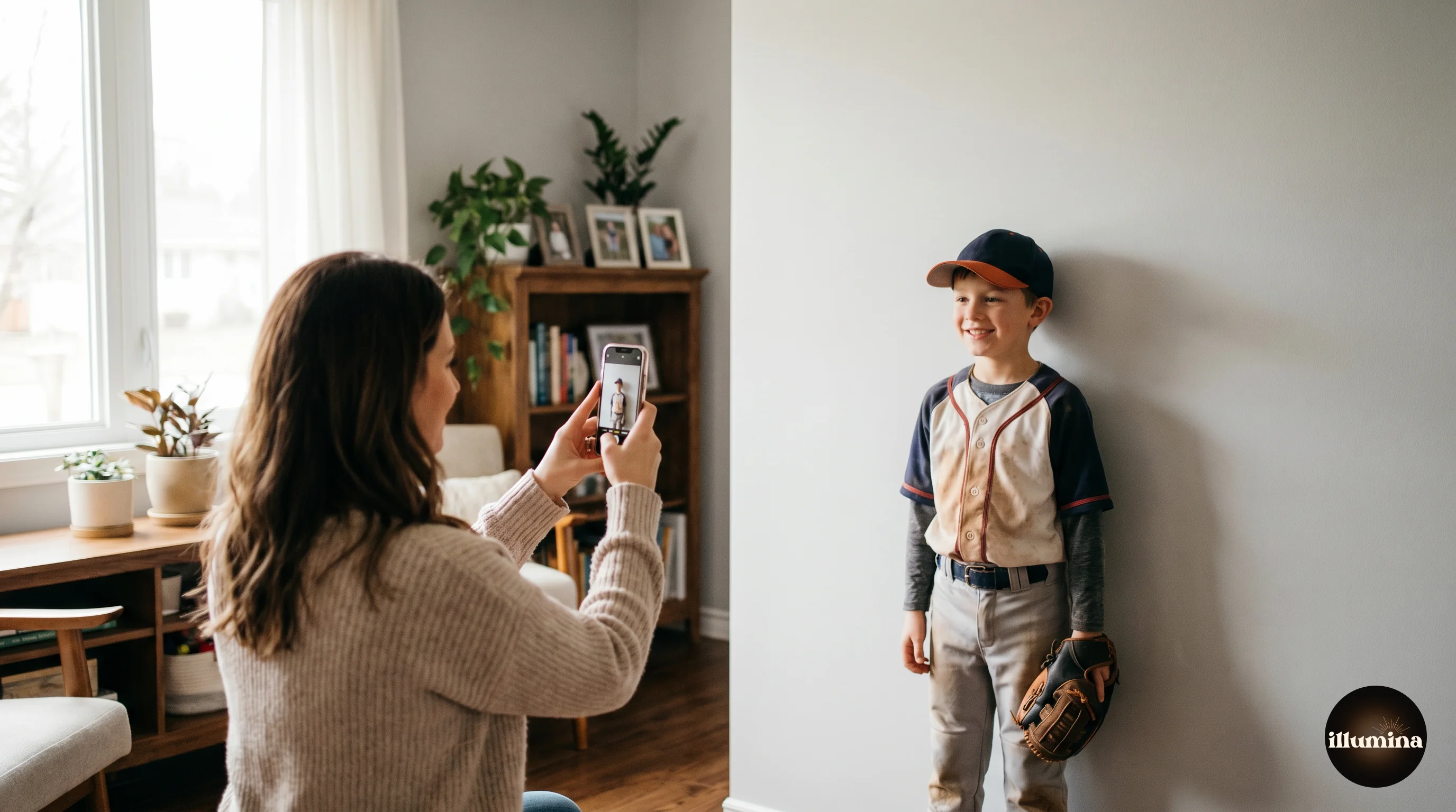
Take a photo of your subject against a plain, evenly-lit background. A grey, white, or solid-colour wall works. A green screen works even better if you have one, but it's not required. The goal is a clear, obvious edge between your subject and whatever is behind them, because that edge is what the cutout tools look for. Busy backgrounds, patterned wallpaper, or a subject wearing a colour that matches the wall will all make the next step harder than it needs to be.
For lighting, soft and even beats bright and harsh. Window light on an overcast day is perfect, and free. If you're indoors, face your subject toward a big window or use a couple of soft lamps on either side. What you're trying to avoid is one hard shadow slicing across their face, because that shadow will follow them onto the new backdrop and give the game away.
Yes, your phone is good enough
If you don't own a fancy camera, don't worry for a second. A modern phone takes lovely photos for this, and most composites people make start life as a quick phone snap. You just have to give the phone a little help.
A handful of phone habits and settings that make a real difference:
- Give the lens a quick wipe first. Phones live in pockets and bags, and a smudged lens is the number one reason photos come out soft and hazy.
- Turn on the gridlines (it's tucked in your camera settings) and keep your child's eyes up near the top third of the frame. It instantly looks more composed.
- Tap your subject on the screen before you take the shot. That locks the focus and brightness onto them, so the phone doesn't expose for the bright wall and leave your child looking dark.
- Turn Portrait mode off for this one. I switch it off every single time, because that pretend background blur confuses the cutout tools and leaves messy edges, and you're swapping the background anyway.
- Step closer instead of pinching to zoom. Zooming on a phone just crops and softens the picture. Your feet are the best zoom lens you own.
- Stand near a window for soft daylight and skip the flash. The built-in flash flattens faces and throws a hard shadow on the wall behind them.
- If your phone has a resolution or quality setting, pick the highest one so you've got plenty of detail to work with for prints later.
A few more practical things that help a lot:
- Leave a bit of space around your subject in the frame so you don't accidentally crop off an elbow or the top of their head.
- Photograph them at roughly the same angle as the backdrop. If the backdrop looks like it was taken at eye level, take your photo at eye level too.
- Watch out for flyaway hair against the wall. It's not a dealbreaker, but loose strands are the trickiest thing to cut out cleanly.
If you want to go even deeper, our guide to photographing subjects for composites covers focus, distance, and how to match your lighting to the backdrop.
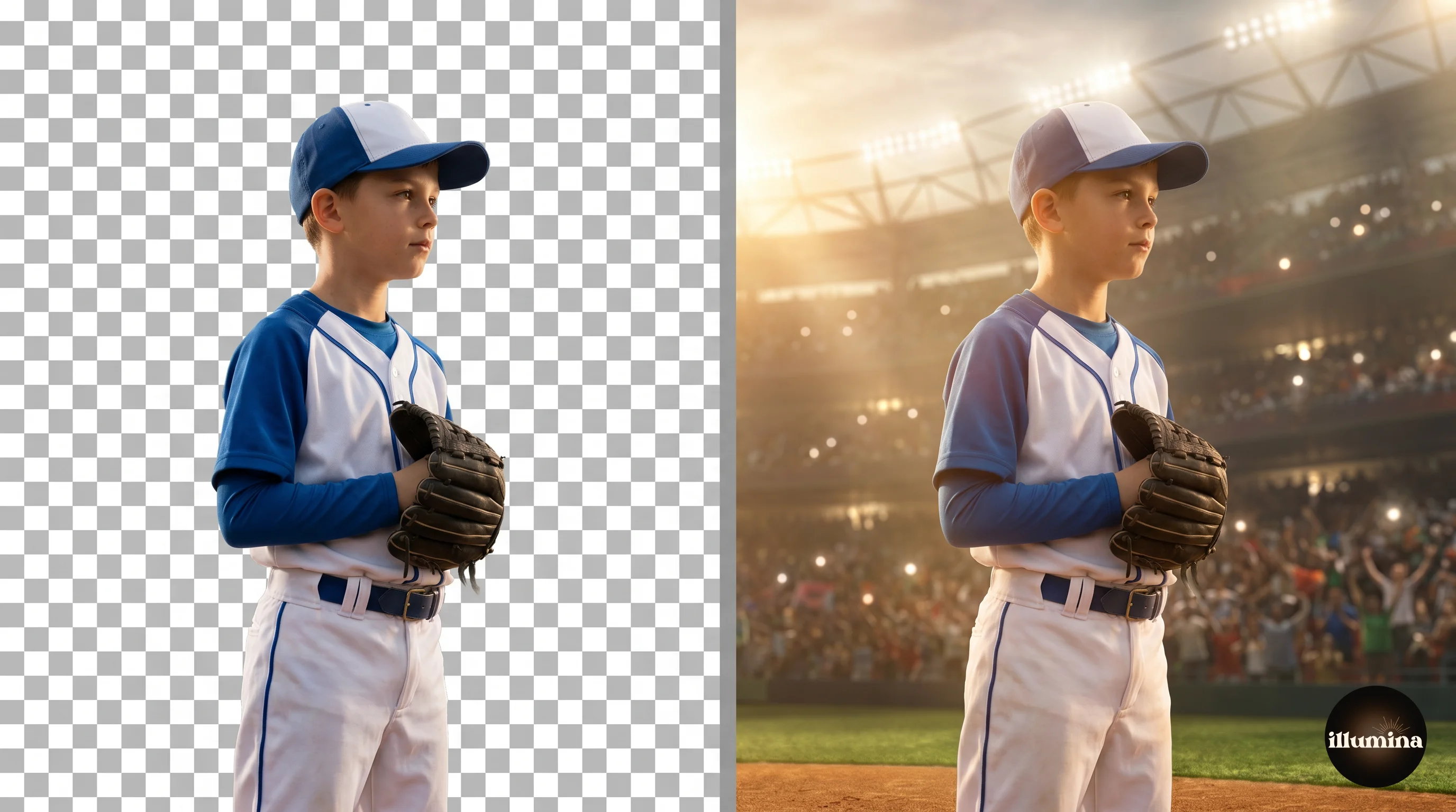
Step 3: Cut Out the Background Behind Your Subject
Now you "cut out" your subject, which just means removing the wall behind them so only the person is left, floating on a transparent layer. This used to be slow, fiddly work. Now the computer does almost all of it in a few seconds.
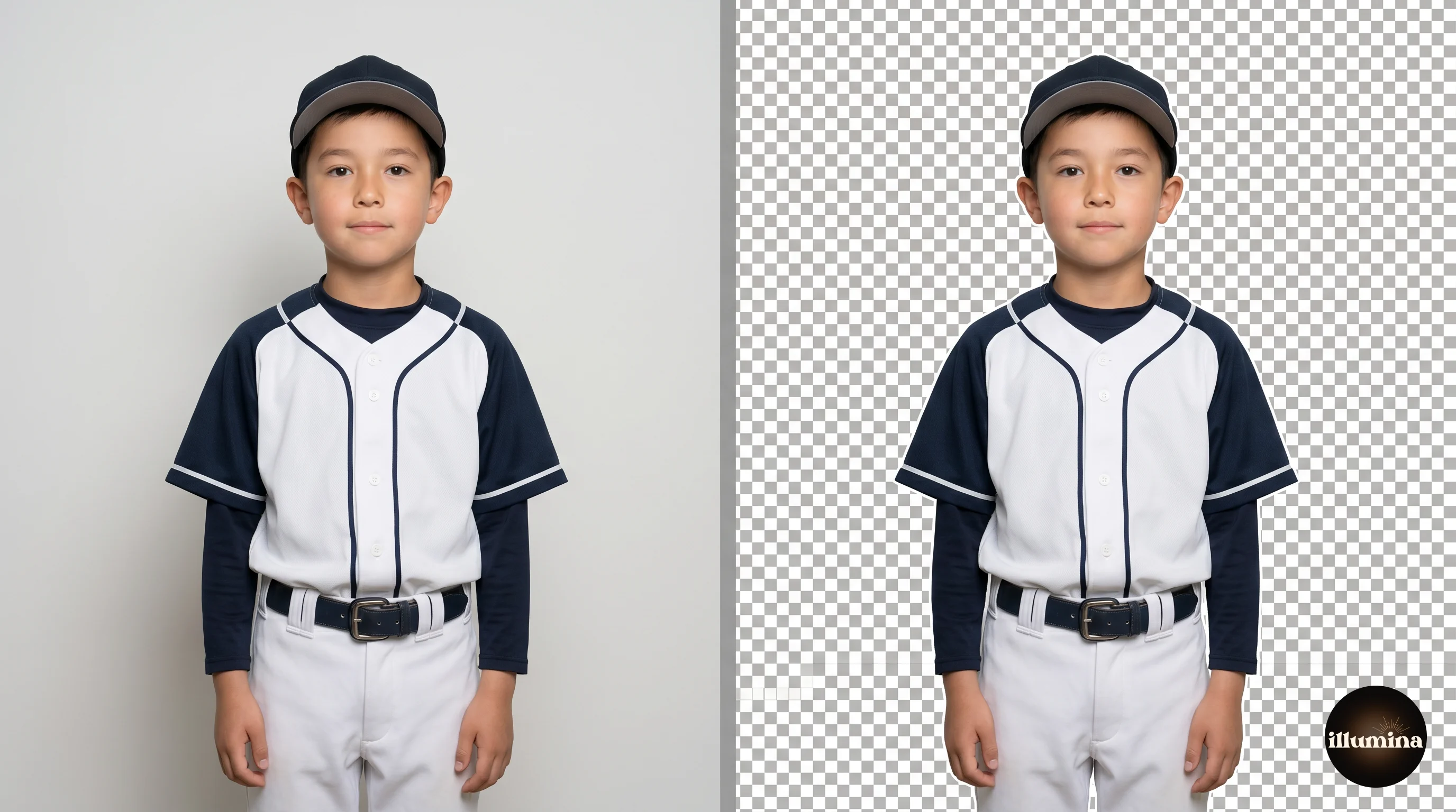
The fastest free option is remove.bg. Upload your photo, wait a few seconds, and download the result as a PNG with the background already gone. For a lot of photos that's all you'll ever need. Canva Pro has a one-click BG Remover built in, and Photoshop has its own Remove Background button. They all use the same kind of AI and they all work well. If I'm only doing one or two photos, I reach for remove.bg first, because there's nothing to learn.
The one thing to check before you move on is the edges, especially around hair. Zoom in. If you see a thin halo of the old wall colour clinging to your subject, or chunks of hair that got chopped off, fix it now rather than after you've built the whole composite. Most tools have an "erase" and "restore" brush for exactly those spots.
I'm keeping this short because we have a whole separate walkthrough on it. If your cutout is giving you trouble, the background removal guide compares every method and shows you how to rescue messy hair edges.
Canva or Photoshop? Pick Your Path
From here the steps split depending on which tool you're using, so I've written both. You don't need to read both. Pick one and follow it.
Go with Canva if you want the easiest possible path, you're working on a laptop or even your phone, and you're making images for social media, gifts, or smaller prints. It's free to start and forgiving of mistakes, so you'll get a good result without learning anything technical.
Go with Photoshop if you want to print big, or you just want full control over every detail like shadows and fine edges. There's more of a learning curve, but the ceiling is much higher. If you like the idea of Photoshop's control but not its price, Photopea is a free browser tool that works almost identically, and these steps mostly carry over to it.
One more thing before you choose: if all you have is your phone, Canva is your answer. The free Canva app runs this entire workflow, start to finish, on a phone screen. You lose the fine control of a big monitor, which matters for large prints but not for social posts or gifts, and you can make a lovely composite without ever opening a laptop.
Adding Your Photo to a Backdrop in Canva
This is the gentle path, and it's all most people need.
Set your canvas size first
Start a new design and set the size before anything else, because changing it later is a pain. For a print you want to go large, something like 4000 by 6000 pixels. For Instagram, use 1080 by 1350. For Pinterest, 1000 by 1500. Setting the right canvas now saves you a blurry surprise at the end.
Add your backdrop, then your subject
Click Uploads on the left and bring in your chosen Illumina backdrop. Drag it onto the canvas and stretch it to fill the whole space, edge to edge. Then right-click and Lock it so you don't shove it around by accident while you work on top. Now upload your cut-out subject (the transparent PNG from Step 3) and drag it on top of the backdrop.
Get the scale believable
Resize your subject by dragging a corner, and here's where people rush: get the size right. A child who towers over a whole stadium, or a tiny person lost in a big floral scene, breaks the illusion straight away. Look at the backdrop for clues about scale, like a doorway or a bench, and match your subject to it. When in doubt, go slightly smaller rather than bigger.
Layering more than one person
If you're building a team or family photo, bring each person in as their own layer and overlap them naturally, with the people meant to be in front sitting on top of the ones behind. Canva stacks things in the order you add them, so if someone ends up behind the backdrop, right-click and use Bring to front or Send to back to sort it out.
That's the composite built. Before you save, jump down to the lighting and colour section, because that's what takes a Canva composite from "nice" to "wait, is that real?" If you want more Canva tricks, our Canva composites guide goes further.
Adding Your Photo to a Backdrop in Photoshop
Photoshop takes a few more clicks, but it pays you back with control you can't get anywhere else.
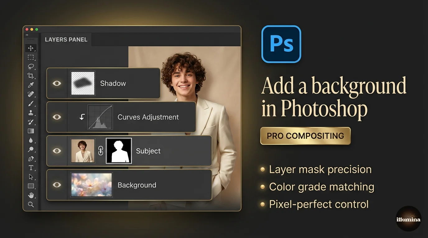
Set up your layers
Open your Illumina backdrop first. Then open your cut-out subject and drag it onto the backdrop document, or copy and paste it in. Look at your Layers panel on the right: you want the backdrop on the bottom and your subject sitting above it. If your subject still has its old background attached, extract it first using Select > Subject, then add a layer mask. (Again, the removal guide has the full method.)
Press Ctrl+T on Windows or Cmd+T on a Mac to resize and move your subject. Hold Shift while dragging a corner so they don't stretch into a funhouse-mirror version of themselves. Position them where they belong in the scene, paying attention to where their feet land so they look like they're standing on something, not hovering.
Clean up the edges
Zoom in to 200% and check the edges. Even a good cutout leaves little imperfections. Open Select and Mask, tick Decontaminate Colors to wipe out any leftover halo from the old background, and use a tiny amount of Feather, around half a pixel to one pixel, to soften a razor-sharp edge. Go gentle here. Too much feather and your subject turns into a ghost.
Add a shadow (the step that sells it)
This is the single thing that makes a composite believable. Make a new layer just below your subject, set it to Multiply, grab a soft black brush at about 15% opacity, and gently paint a small shadow where their feet meet the ground. Build it up slowly with light strokes. Match the direction to the light in the backdrop, so if the light comes from the left, the shadow falls to the right. Skip this and your subject floats. Spend two minutes on it and people stop being able to tell it's a composite.
None of that shadow work is required to get a good image, so if it feels like too much the first time, leave it. You can always come back to it on your next one.
Transform Your Photos
Give Your Photos the Wow Factor
Browse our collection of premium digital photo backdrops. 50 high-resolution print-ready backgrounds in each pack. Instant download.
Browse Backdrops
Matching the Lighting and Colours
This is the secret sauce, and it's the step beginners most often skip. Your subject and your backdrop were photographed in two different places under two different lights. If you don't nudge them toward each other, your eye picks up the mismatch even if your brain can't say why.
The two things to match are brightness and warmth. If your backdrop is a warm, golden sunset and your subject looks cool and a bit blue, warm them up. If your backdrop is a moody, dark scene and your subject is brightly lit, bring their brightness down so they belong in that world.
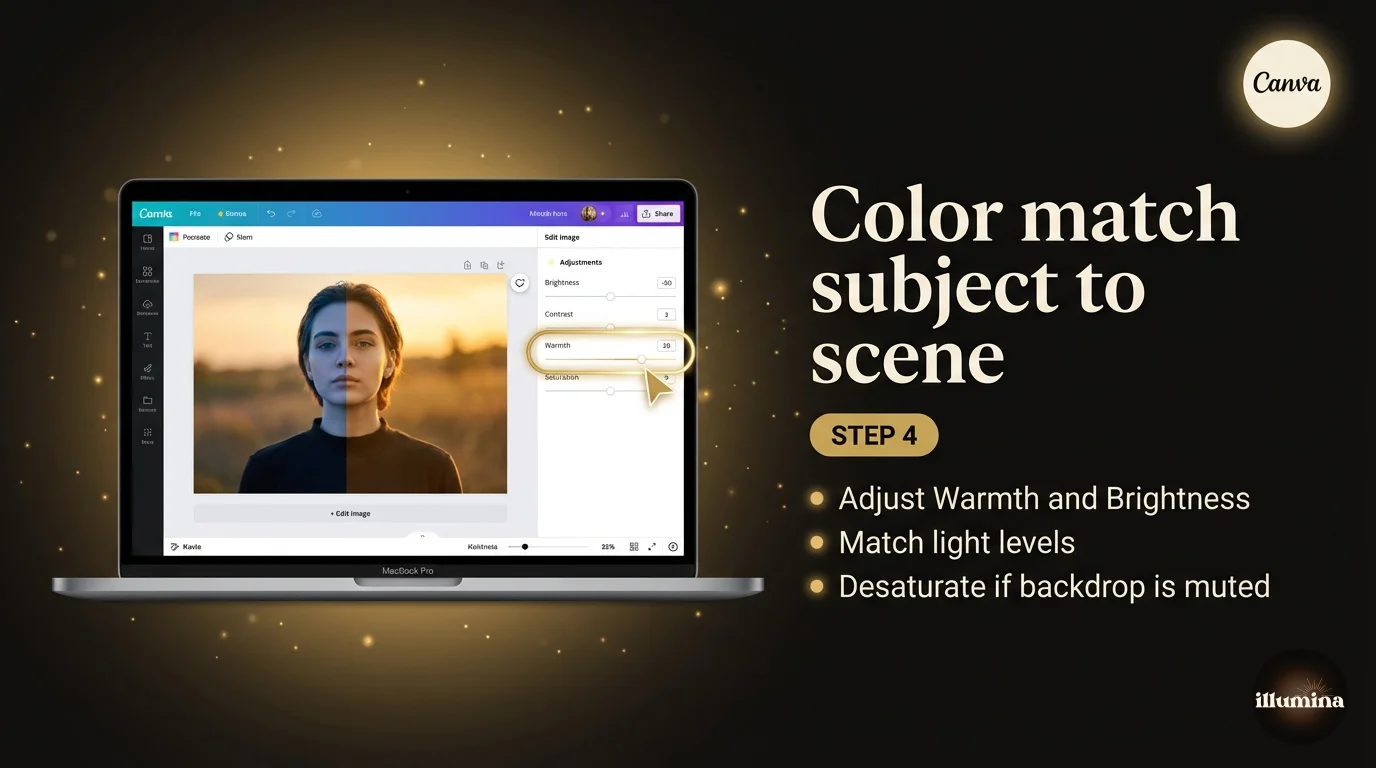
In Canva
Click your subject, hit Edit, and play with Brightness, Contrast, and Warmth until they sit naturally in the scene. Small moves. You're nudging, not cranking. A trick that works surprisingly well is applying the same subtle filter to both the subject and the backdrop so they share a look.
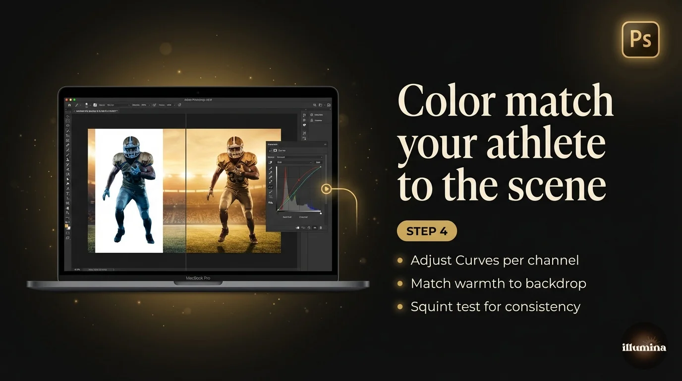
In Photoshop
Add a Curves adjustment layer and clip it to your subject only (hold Alt or Option and click the line between the two layers). Now you can brighten or darken the person without touching the backdrop. Add a Color Balance layer the same way and shift the midtones toward the backdrop's temperature. Warm scene, push toward yellow and red. Cool scene, push toward blue.
The move that ties it all together is one final adjustment layer over the whole image, a gentle colour grade that shifts the entire picture in one direction. It forces the subject and backdrop to share the same colour cast and quietly hides any leftover mismatch. It's the same thing film colourists do to make shots from different cameras look like one movie. If you want the full breakdown, the colour matching guide is the deep dive.
Presets: The Shortcut to a Polished Look
A preset is a saved bundle of edits you apply in one click. Instead of fiddling with five sliders, you tap a preset and it does the colour grade for you. They're the lazy person's path to a consistent, polished look, and I mean lazy as a compliment.
In Canva you already have presets built in. With your whole design selected, open Edit and scroll the Filters row. Apply one lightly across the entire composite and it ties the subject and backdrop together. That's the easiest unifying trick there is.
For Photoshop and Lightroom, the magic words are presets (for Lightroom) and LUTs (for Photoshop colour grades). A few good, free sources I'd point you to:
- ON1's free LUT packs, which drop straight into Photoshop as a Color Lookup adjustment layer.
- CINECOLOR's free sample pack, modern film-inspired looks for both Lightroom and Photoshop.
- FreePresets.io, a big library of free Lightroom presets sorted by mood.
One warning though: presets are a starting point, not a finish line. They're built for someone else's photo, so after you apply one you'll almost always want to pull the brightness back a touch. A preset gets you 80% of the way in one click. The last 20% is still you.
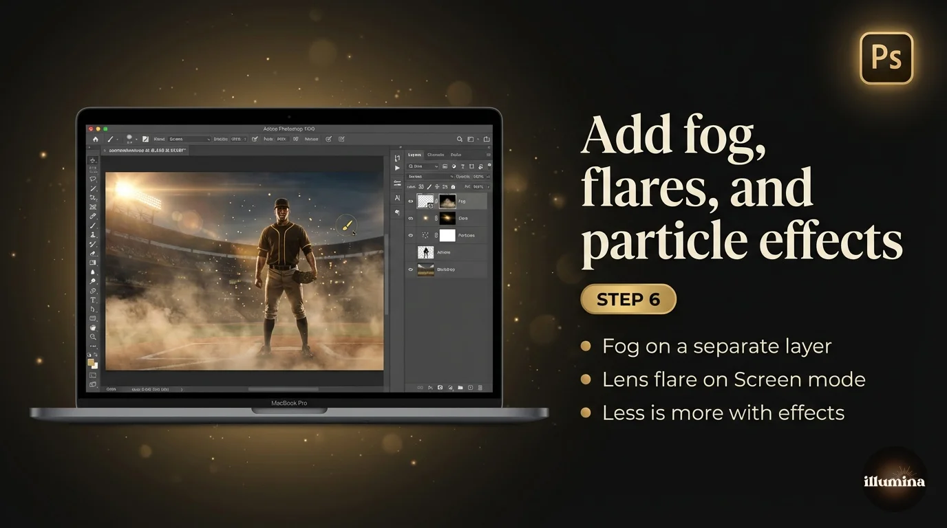
Adding Overlays (Smoke, Fog, and Light)
Overlays are the fun part. An overlay is a transparent effect, like a wisp of fog, a curl of smoke, a fall of light, or a scatter of sparkles, that you lay over your composite to add atmosphere and depth. For sports composites especially, a bit of low fog drifting around a player's legs or a haze of stadium light makes the whole thing feel cinematic.
You'll find plenty of free, high-quality overlays here:
- Brusheezy fog overlays and smoke overlays, hundreds of free downloads.
- Brusheezy's general overlay library for light leaks, dust, and bokeh.
- StudioBinder's free fog overlay pack if you want a curated starter set.
Using one is easy in both tools. Download the overlay (it'll usually be a black image with white smoke or fog on it), then drop it on top of your composite as a new layer. The trick is the blend mode: set the overlay layer to Screen and the black background vanishes, leaving only the smoke or light. In Photoshop the blend mode menu sits at the top of the Layers panel. In Canva, you'd upload a transparent PNG overlay instead, since Canva doesn't have a Screen blend mode, so grab the PNG version when one's offered.
Keep it subtle. The temptation is to pile on smoke until your kid is lost in a fog machine. A little goes a long way. Drop the overlay's opacity down until it whispers rather than shouts. Our sports composite guide has more on overlays and the dramatic stadium look if that's your thing.
Saving and Downloading Your Finished Photo
You're done editing. Now get it out of the program in the right format, because this is where good work sometimes gets ruined by a wrong setting.
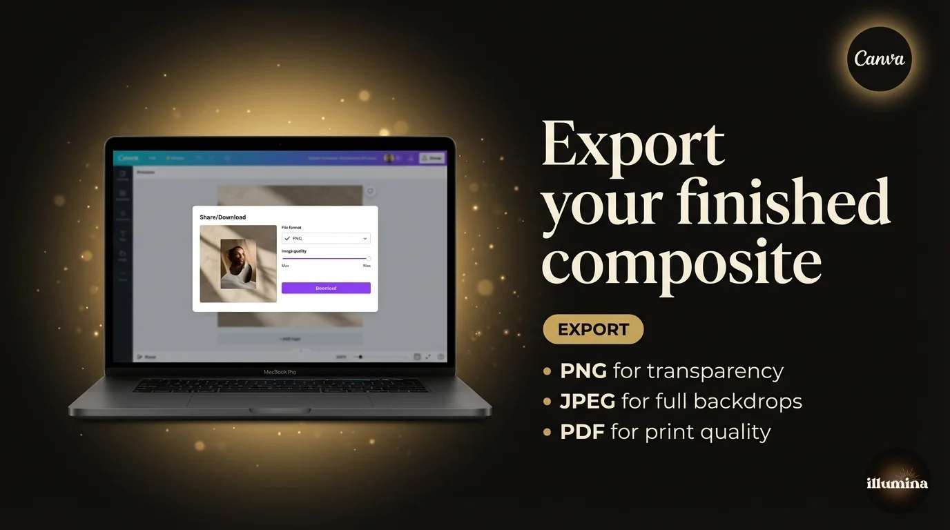
From Canva
Click Share, then Download. For printing, choose PNG and tick the highest quality option. For social media, JPG is fine and the files are smaller, so they upload faster. If you set a big canvas size back at the start, your print file will be sharp. If you started small, no export setting can rescue it, which is why size-first matters.
From Photoshop
Use File > Export > Export As. Pick JPG at maximum quality for prints and most uses, or PNG if you need a transparent background. For professional print labs, save a TIFF if they ask for it. Always keep your layered .PSD file too, so you can come back and re-edit later without starting over. Future you will be grateful.
A quick word on print resolution, since it trips people up. Print shops want about 300 DPI, which is just how many dots fit per inch. A 4000 by 6000 pixel file prints beautifully at 13x20 inches. The same photo at 1080 by 1080 would print as a fuzzy 3.6-inch square. If you plan to print, the printing composites guide walks through sizing for every common print size.
A Few Things That Make a Big Difference
These are the small fixes that separate a composite that fools the eye from one that looks like a school collage. None of them are hard once you know to look for them.
Watch the scale. A subject that's too big or too small for the scene is the most common giveaway, and it's an easy fix. Use the doors, benches, or other people in the backdrop to judge size.
Mind the light direction. If the backdrop's light comes from the right but your subject was lit from the left, the brain reads "fake" instantly. In a pinch you can flip your subject horizontally to match, just check there's no backwards text on a jersey or sign first.
Don't forget the shadow. I said it in the Photoshop section and I'll say it again because it matters that much. A simple soft shadow under the feet anchors your subject to the ground. It's the difference between standing and floating.
And know when to stop. There's a real temptation to keep tweaking, more colour, more blur, more contrast, until the whole thing looks overcooked. Once it looks right at full zoom, walk away for ten minutes. Come back with fresh eyes, make one last small pass, then call it done.
Quick Questions
Do I really need Photoshop?
No, and most people never touch it. The free version of Canva, plus a free background remover like remove.bg, is enough to make a composite you'll be happy to print or post. Photoshop is worth it only if you want fine control over edges and shadows, or you're making a lot of these.
Can I do all of this on my phone?
Yes, start to finish. Take the photo on your phone, remove the background in the Canva app or remove.bg, then build the composite in the free Canva app. The only thing you give up on a phone is the fine control of a big screen, which matters for large prints but not for social posts or gifts.
What size should I export for printing?
Aim for around 300 DPI at your print size. A 4000 by 6000 pixel file covers most common prints up to about 13x20 inches. Start your canvas large, because you can shrink a big file but you can't add detail back to a small one.
The edges around my subject look rough. How do I fix that?
Zoom in and look for a halo of the old background colour or chopped-off hair. In Photoshop, Select and Mask with Decontaminate Colors cleans it up. In Canva, use the erase and restore brushes after removing the background. Our background removal guide covers the tricky hair cases.
My composite still looks pasted on. What am I missing?
Almost always one of three things: the colours don't match (a warm subject on a cool backdrop, or the reverse), there's no shadow under the subject, or the scale is off. Fix those three and most composites click into place.
How long does this take?
Your first one might take half an hour while you find all the buttons. By your tenth, it's five minutes. The skill carries over, so every pack you buy after this gets faster to use.
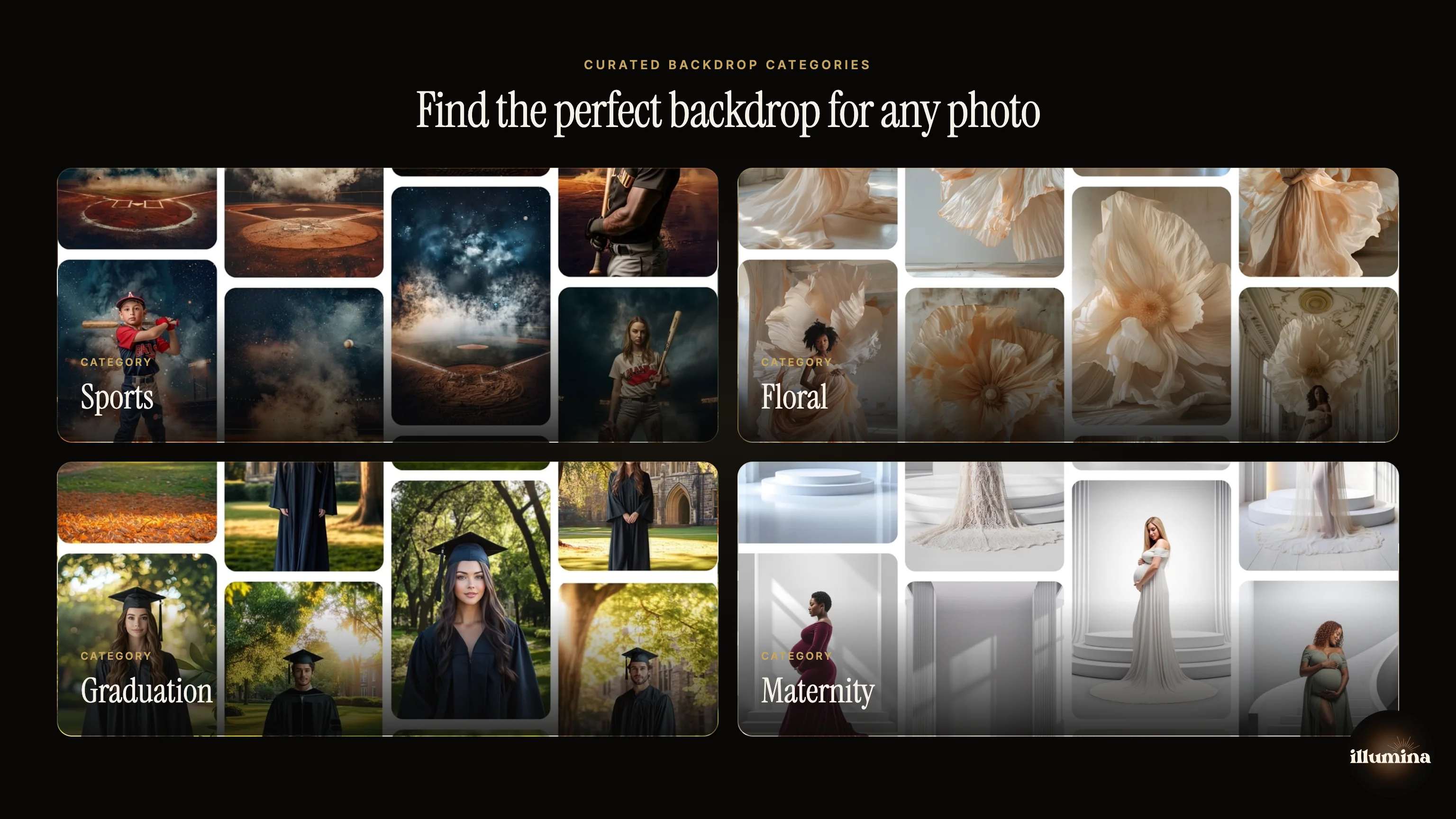
Need more backdrops to play with?
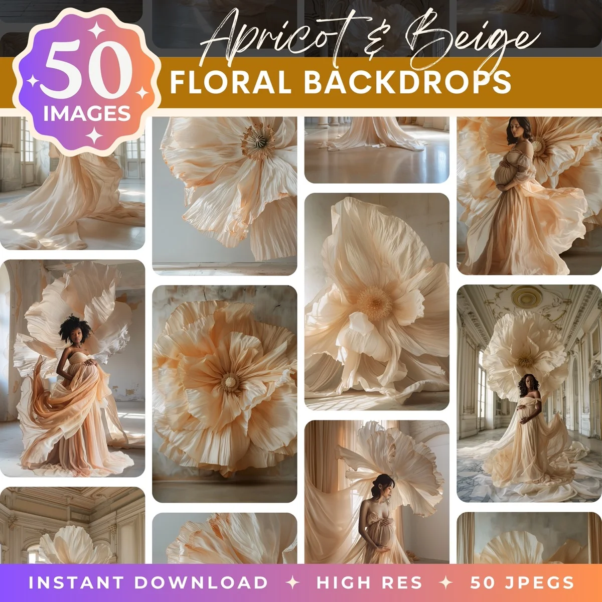
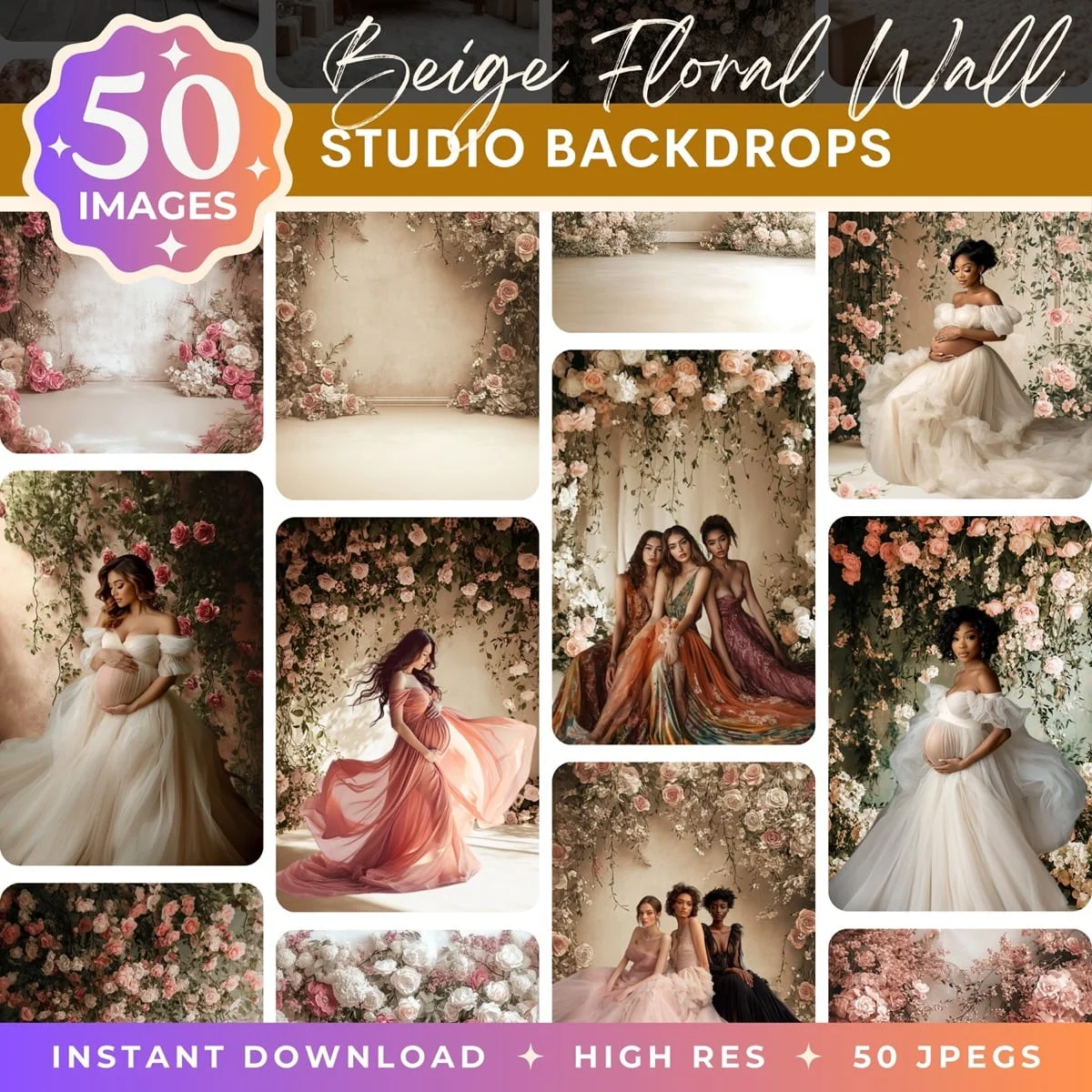
Every Illumina Backdrops pack gives you 50 high-resolution scenes (6000px+) in both portrait and landscape, built specifically for clean, print-ready compositing.
Browse the full collection →You've Got This
That's the whole workflow: download, take the photo, cut out, place, match, and save, with overlays and presets as optional flourishes once you're comfortable. The first composite you make might take a while as you find your way around. The tenth will fly by, and you'll be reaching for fog overlays and clipped Curves layers without thinking about it.
If you want to branch off into any single step, the deeper guides are all linked above. And whenever you're ready for fresh scenes, browse our sports, maternity, and floral packs, or build your own custom pack from any backdrops you like. Now go make something lovely.
Transform Your Photos
Give Your Photos the Wow Factor
Browse our collection of premium digital photo backdrops. 50 high-resolution print-ready backgrounds in each pack. Instant download.
Browse Backdrops

